The best SaaS websites of 2026 go far beyond listing features and pricing tables. They create immediate trust through stunning visuals, demonstrate product value and social proof instantly, simplify complex technical information and motivate the user to take action. Whether you’re a SaaS founder looking to redesign your outdated site or a product team seeking SaaS web design inspiration, these 10 companies demonstrate what top-tier SaaS website design looks like in 2026.
What Makes a SaaS Website Design Stand Out?
Before exploring our featured companies, let’s examine what separates exceptional SaaS websites from mediocre ones. The most effective SaaS website designs share critical characteristics:
- Clear, benefit-focused messaging that instantly communicates value.
- Modern, visually striking design that reflects product innovation.
- Intuitive navigation that helps visitors find key information in seconds.
- Mobile-responsive design that delivers flawless experiences on all devices.
- Prominent calls-to-action that convert visitors into trial users and demos.
- High-quality product demonstrations and interface previews that showcase functionality.
- Trust signals like customer logos, testimonials and usage statistics.
- Strategic use of white space, typography and colour psychology.
Today’s SaaS buyers expect transparency and credibility. They want instant access to your product capabilities, clear information about pricing and features, interactive demos or product tours, responsive support options and evidence of your track record through case studies and customer success stories. The SaaS web design examples below understand these modern expectations and have created digital experiences that convert website visitors into paying customers.
Top SaaS Website Rankings:
1. College House
Website: https://collegehouse.com/
Company Overview: College House is a data analytics and intelligence platform specifically designed for the student housing industry. Founded in 2019 and based in Atlanta, the company has quickly become the industry’s most trusted source of data, now part of Green Street. College House processes extensive datasets covering over 280 markets, 3,000+ properties and 1.1 million beds across the United States, serving property managers, developers, investors, lenders and brokers who rely on data-driven insights to make critical business decisions. This website was designed and developed by Azuro Digital – we’re an industry-leading SaaS web design agency.
Why Their Website Design is Top Tier:
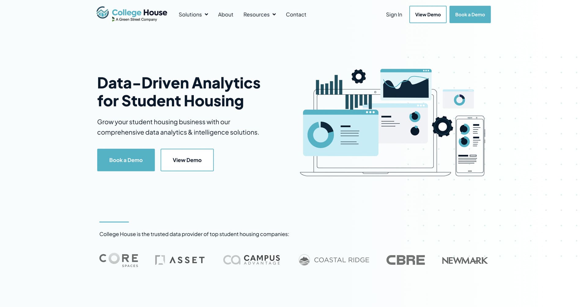
- Data Visualization Excellence: College House masterfully presents complex analytics through clean, digestible visualizations – featuring interactive charts, property-level metrics and market trends that transform overwhelming data into actionable insights, demonstrating the platform’s analytical power without intimidating non-technical audiences.
- Segmented User Journey Design: The website brilliantly organizes content by customer segment, with dedicated sections for property managers, developers, investors and lenders that speak directly to each audience’s unique needs and pain points, ensuring every visitor finds immediately relevant use cases.
- Trust-Building Through Social Proof: Strategic placement of recognizable industry leader logos – including CBRE, Core Spaces and Asset Living – combined with detailed testimonials from executives provides immediate credibility and positions College House as the industry standard for student housing data.
- Professional B2B Aesthetic: The design employs a stunning colour palette, clean typography and generous white space that conveys enterprise-grade reliability and professionalism.
2. Stripe
Website: https://stripe.com/
Company Overview: Stripe is a financial infrastructure platform for the internet, founded in 2010 by brothers Patrick and John Collison. Processing hundreds of billions of dollars annually, Stripe powers online payment processing for millions of businesses worldwide – from startups to Fortune 500 companies like Amazon, Google, Shopify and Zoom. As a comprehensive payments and financial services solution, Stripe offers everything from payment processing and billing to fraud prevention and revenue optimization.
Why Their Website Design is Top Tier:
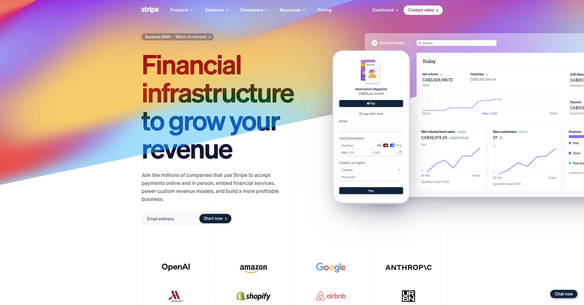
- Mesmerizing Animated Gradients: Stripe’s homepage features continuously flowing gradient animations that transition seamlessly through complementary colours – blues, purples, yellows, pinks and oranges – creating an instantly memorable visual experience that conveys technical sophistication and forward-thinking innovation.
- Developer-First Messaging: The design brilliantly balances technical depth with accessibility, using clear code snippets and API examples that speak directly to developers while remaining approachable for business decision-makers evaluating payment solutions.
- Strategic Product Visualization: Rather than overwhelming visitors with every feature, Stripe uses elegant animations and micro-interactions to progressively reveal product capabilities, keeping users engaged while demonstrating the platform’s comprehensive nature.
- Trust Through Scale: The design strategically showcases impressive statistics and recognizable customer logos throughout the experience, building immediate credibility and demonstrating Stripe’s position as the industry-standard payment infrastructure.
3. Notion
Website: https://www.notion.com/
Company Overview: Notion is an all-in-one workspace that combines notes, documents, databases and project management into a single collaborative platform. Founded in 2016, Notion has grown to serve millions of users and thousands of companies worldwide, fundamentally changing how teams organize information and collaborate. Known for its flexibility and customization options, Notion appeals to everyone from individual creators to enterprise teams at companies like Figma, Pixar and Spotify.
Why Their Website Design is Top Tier:
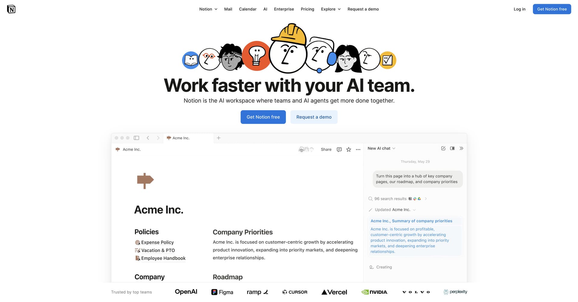
- Cohesive Visual Identity: Notion’s custom illustration style – featuring warm, pastel colours and playful characters – creates an instantly recognizable brand that differentiates them in a sea of corporate SaaS websites while making productivity software feel approachable and human.
- Use Case Clarity: The website organizes content by user personas and use cases, with dedicated pathways for teams, students, personal use and specific industries, ensuring every visitor finds immediately relevant information tailored to their needs.
- Product-in-Context Demonstrations: Rather than generic feature lists, Notion showcases its product through realistic templates and use cases, helping visitors visualize exactly how the platform would work in their specific workflows and eliminating abstract feature confusion.
- Community-Driven Social Proof: The design prominently features real user-created templates, customer stories and community contributions, demonstrating a vibrant ecosystem and building trust through authentic user experiences rather than corporate testimonials alone.
4. Linear

Website: https://linear.app/
Company Overview: Linear is a modern issue tracking and project management tool built specifically for high-performance software teams. Founded by former Airbnb engineers in 2019, Linear has quickly become the preferred alternative to tools like Jira for companies prioritizing speed, design and engineering-focused workflows. Used by thousands of engineering teams including Vercel, Loom and Ramp, Linear is known for its exceptionally fast performance and thoughtful user experience.
Why Their Website Design is Top Tier:
- Masterclass in Restraint: Linear’s design exemplifies the principle that less is more – every element from typography to spacing is precisely calibrated, creating an interface that feels both sophisticated and effortless, perfectly mirroring the product’s own philosophy of removing friction from workflows.
- Intentional Interactivity: Subtle animations and live product previews demonstrate Linear’s legendary speed and responsiveness without ever feeling gimmicky, using motion purposefully to enhance understanding rather than distract from content.
- Niche-Focused Messaging: Unlike competitors trying to appeal to everyone, Linear’s copy speaks directly and confidently to technical, product-minded teams, using language and references that resonate deeply with their specific audience without diluting the message for mass appeal.
- Visual Product Demonstrations: The website integrates actual Linear interface screenshots and interactive elements seamlessly into the design, giving visitors an authentic preview of the product experience and building confidence through transparency.
5. Dropbox
Website: https://www.dropbox.com/
Company Overview: Dropbox is a cloud storage and file collaboration platform that has fundamentally changed how people work with files. Founded in 2007, Dropbox pioneered modern cloud storage and now serves over 700 million registered users and 600,000 business customers worldwide. Beyond simple file storage, Dropbox has evolved into a comprehensive collaboration platform offering features like Dropbox Paper, file requests, digital signatures and advanced sharing capabilities.
Why Their Website Design is Top Tier:
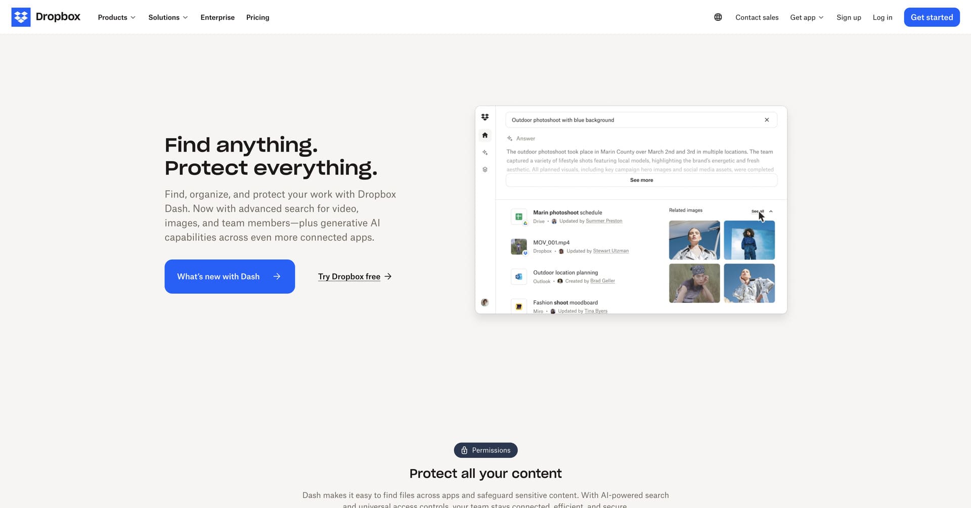
- Clean Modern Design: Dropbox embraces a minimalist design philosophy with bold typography, strategic use of colour and generous white space that creates a sense of calm and simplicity – perfectly reflecting the platform’s promise to simplify file management and streamline workflows.
- Illustration-Driven Storytelling: The website features custom illustrations and graphic elements that bring abstract concepts like “collaboration” and “security” to life, making technical features feel approachable and human while maintaining professional credibility for enterprise audiences.
- Conversion-Optimized Layout: Every section is meticulously designed to guide visitors toward signup, with clear value propositions, prominent CTAs and strategic placement of social proof that builds confidence while removing barriers to trial signups.
- Product Integration Showcase: Rather than listing features generically, Dropbox demonstrates how the platform integrates into existing workflows through realistic scenarios, showing connections with tools like Slack, Zoom and Microsoft Office that resonate with potential customers’ daily work.
6. Canva
Website: https://www.canva.com/
Company Overview: Canva is a graphic design platform that democratizes design by making professional-quality visual content accessible to everyone, regardless of design experience. Founded in 2012, Canva has grown explosively to serve over 135 million monthly active users across 190 countries. From social media graphics to presentations to marketing materials, Canva’s drag-and-drop interface and extensive template library have made it the go-to design tool for individuals, small businesses and Fortune 500 companies alike.
Why Their Website Design is Top Tier:
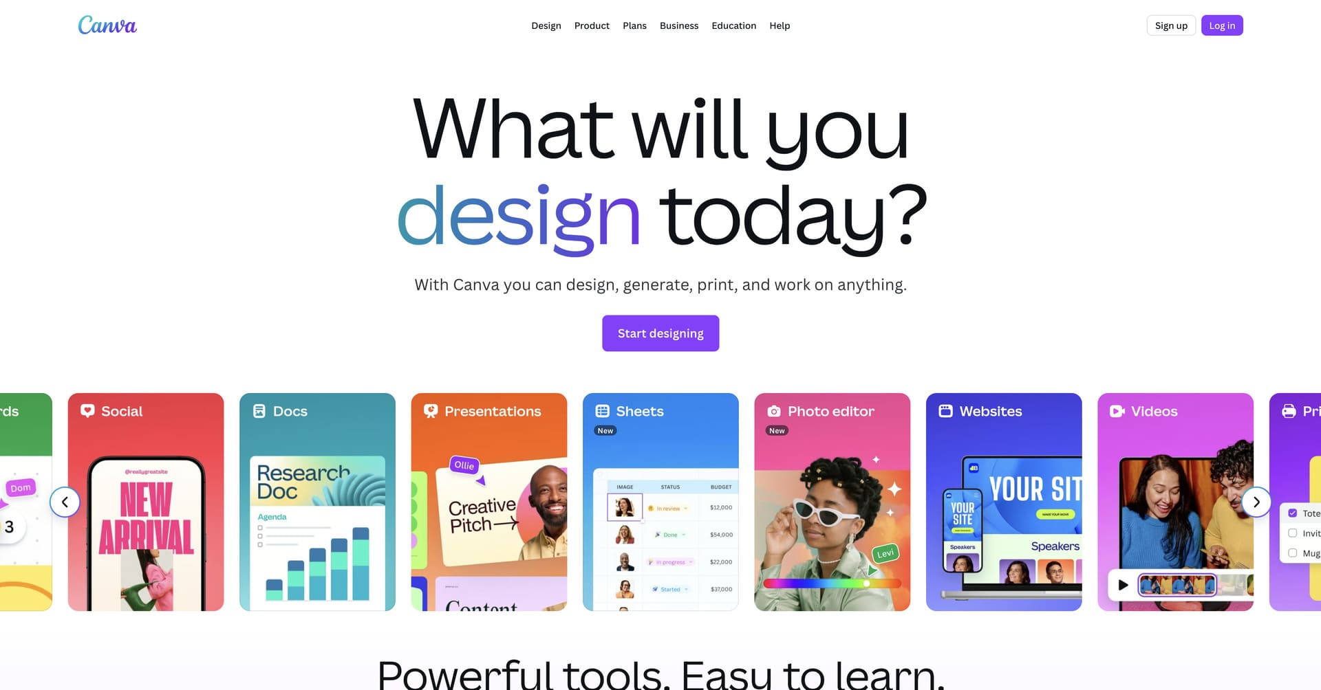
- Vibrant Visual Identity: Canva’s website bursts with colourful, eye-catching design that showcases the platform’s creative possibilities – featuring bold colour palettes, playful illustrations and dynamic layouts that immediately convey the joy and accessibility of design without feeling overwhelming or unprofessional.
- Template Showcase Excellence: The design beautifully displays thousands of user-created templates and designs throughout the site, providing endless inspiration while demonstrating the platform’s versatility across use cases from Instagram posts to business cards to video content.
- Accessibility-Focused Messaging: Unlike competitors that target professional designers, Canva’s copy and visual language speak to everyday users, emphasizing simplicity, speed and results over technical jargon – making design feel achievable for everyone regardless of skill level.
- Free-to-Premium Journey: The website expertly guides visitors from free features to premium capabilities through strategic placement of upgrade prompts, showcasing pro-only features like background remover and brand kits without creating barriers for free users exploring the platform.
7. Slack
Website: https://slack.com/
Company Overview: Slack is a business communication platform that organizes team conversations into channels, transforming how modern companies collaborate internally. Founded in 2013, Slack has become synonymous with workplace messaging, serving over 10 million daily active users and 750,000 organizations worldwide. As a Salesforce company, Slack continues to define the category of team collaboration software with its intuitive interface and extensive integration ecosystem.
Why Their Website Design is Top Tier:
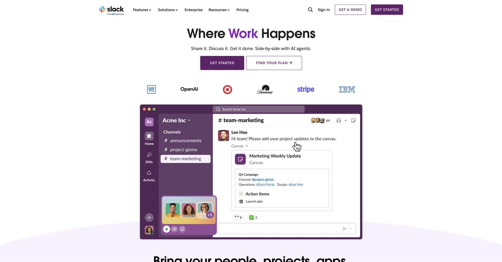
- Gradient Background Excellence: Slack employs stunning gradient backgrounds throughout the site – particularly striking purple, blue and pink combinations – that align perfectly with their brand identity while creating visual interest and depth without obstructing content or impacting readability.
- Use Case Segmentation: The website clearly organizes content by department and use case, with dedicated sections for sales, marketing, engineering and support teams, ensuring every visitor finds immediately relevant examples of how Slack improves their specific workflows.
- Integration Visualization: Rather than simply listing integrations, Slack’s design showcases its extensive app ecosystem through visually engaging galleries and animated demonstrations, helping visitors understand the platform’s role as a central hub for all their tools.
- Results-Oriented Messaging: The site strategically balances feature descriptions with outcome-focused messaging about productivity gains, time savings and efficiency improvements, speaking to both end users and decision-makers evaluating ROI.
8. Airtable
Website: https://www.airtable.com/
Company Overview: Airtable is a cloud-based platform that bridges the gap between spreadsheets and databases, combining the simplicity of a spreadsheet interface with the power of a relational database. Founded in 2012, Airtable has grown to serve over 300,000 organizations worldwide, from startups to Fortune 500 companies. Used for everything from project management to content calendars to product roadmaps, Airtable’s flexibility makes it essential for teams seeking customizable workflows without coding.
Why Their Website Design is Top Tier:
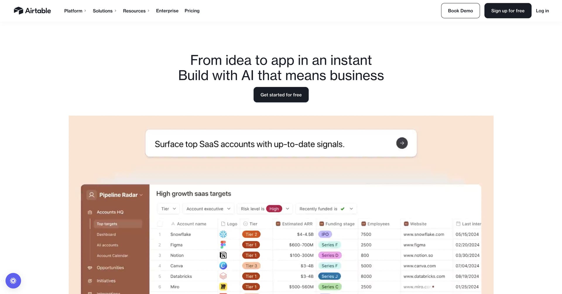
- Minimalist Visual Excellence: Airtable’s design delivers generous white space, clean typography and a calming colour palette that never overwhelms visitors, creating a sophisticated aesthetic that positions the platform as professional and approachable while letting product demonstrations take centre stage.
- Interactive Product Previews: Rather than static screenshots, the website features live, interactive Airtable bases that visitors can explore, offering authentic hands-on experience with the platform’s interface and demonstrating capabilities like custom views, filtering and collaboration in real-time.
- Use Case Clarity: The design nicely organizes content by industry and use case – from marketing teams to product development to HR departments – ensuring every visitor finds immediately relevant examples of how Airtable solves their specific workflow challenges.
- Database Visualization: Airtable masterfully showcases how their spreadsheet-database hybrid works through elegant animations that transform simple data into interconnected, powerful workflows, helping visitors understand complex database concepts through intuitive visual storytelling.
9. Intercom
Website: https://www.intercom.com/
Company Overview: Intercom is a customer messaging platform that enables businesses to communicate with customers through targeted messages, live chat, product tours and support. Founded in 2011, Intercom pioneered conversational customer engagement and now serves over 25,000 businesses worldwide. Known for innovation in customer communication, Intercom continues to lead in areas like conversational support, AI-powered chatbots and personalized customer experiences.
Why Their Website Design is Top Tier:
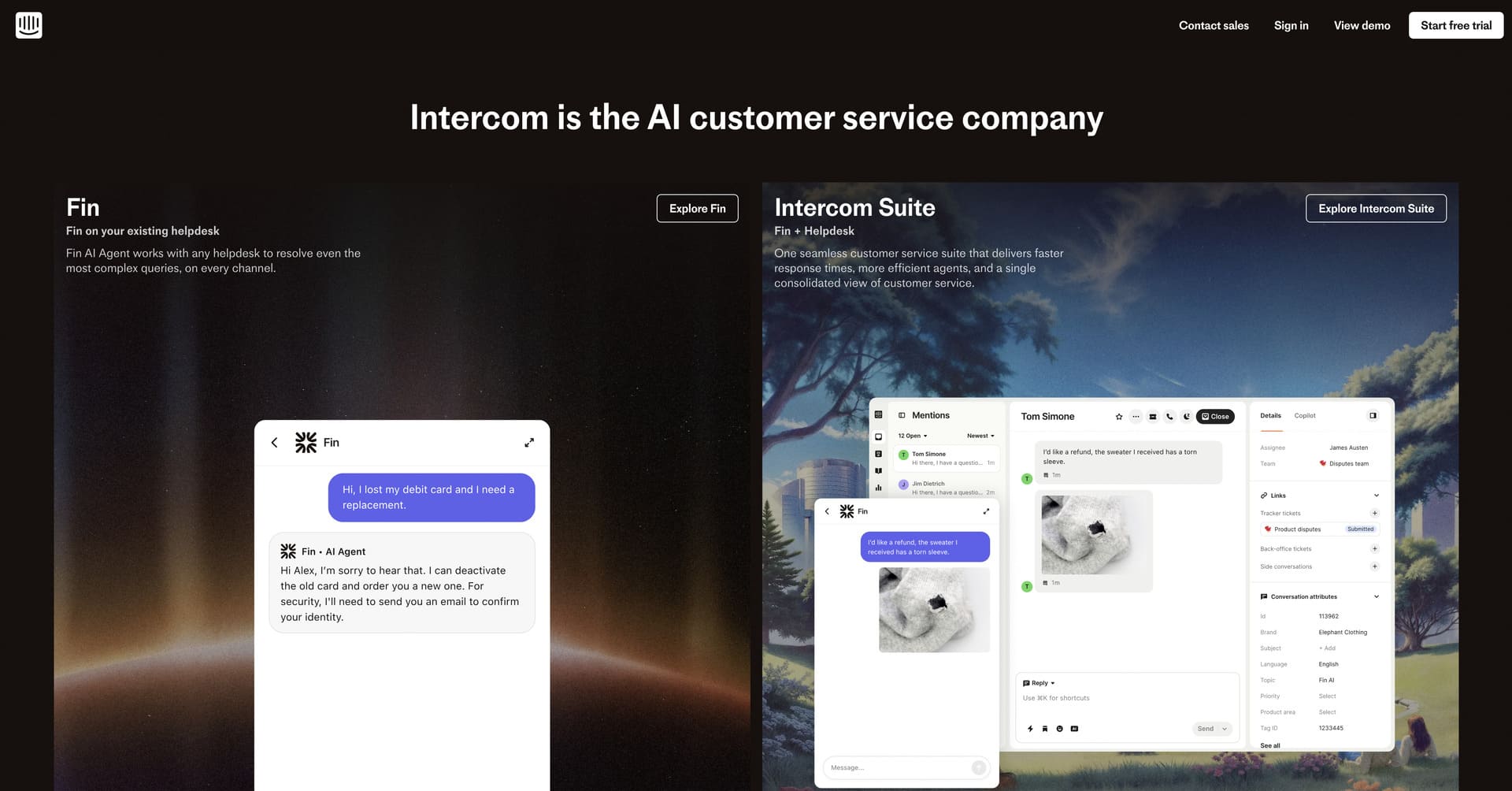
- Dual Audience Homepage Funnel: Intercom’s homepage prominently features their 2 major products – the Fin AI Agent and the Intercom Suite – allowing the visitor to identify which product they’re most interested in, which then leads to a dedicated page with hyper-focused messaging.
- Customer-Centric Storytelling: The design puts customer success stories and real conversations front and centre, using authentic examples of how Intercom improves customer experiences rather than relying on abstract feature descriptions or generic benefits.
- Conversion-Optimized Layout: Every section is strategically designed to move visitors toward conversion, with well-placed CTAs and minimal navigation distractions – building desire while reducing overwhelm throughout the journey.
- Product Integration Previews: Rather than static screenshots, Intercom showcases actual conversation flows, automated messages and support interactions, helping visitors visualize exactly how the platform would work within their customer communication strategy.
10. Loom
Website: https://www.loom.com/
Company Overview: Loom is an asynchronous video messaging platform that enables teams to communicate more effectively through quick screen and camera recordings. Founded in 2016, Loom has become essential for remote work, serving over 14 million users across 200,000 companies worldwide. By making video creation incredibly simple and shareable, Loom has fundamentally changed how teams share knowledge, provide feedback and collaborate asynchronously.
Why Their Website Design is Top Tier:
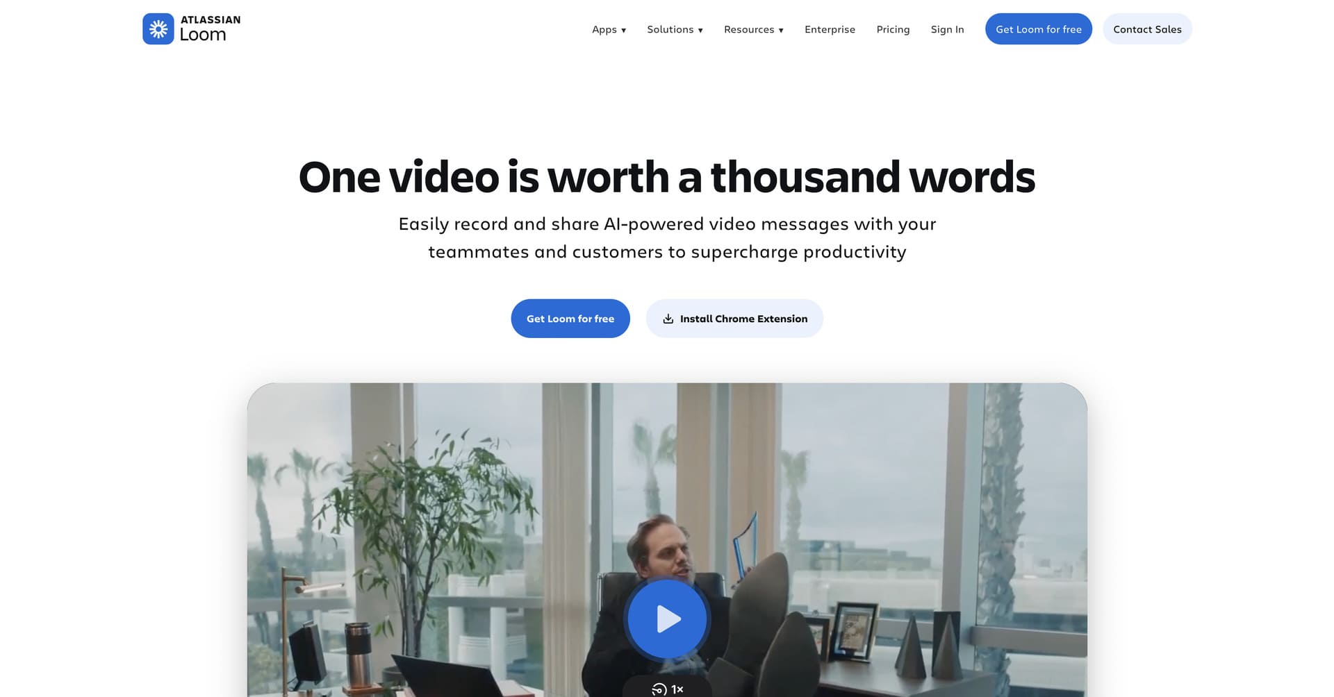
- Simplicity-Focused Design: Loom’s website embraces minimalism in the best possible way, using clear headlines, ample white space and straightforward navigation that removes all friction from understanding what Loom does and why it matters – perfectly mirroring the product’s own simplicity.
- Video-First Experience: The site practices what it preaches by featuring embedded Loom videos throughout – real user testimonials, product walkthroughs and use case demonstrations – creating authentic, engaging content while demonstrating the platform’s capabilities.
- Remote Work Positioning: The design strategically highlights Loom’s value for distributed teams, async communication and remote collaboration, addressing pain points that became critical during the shift to remote work and remain relevant as hybrid work continues.
- Instant Value Communication: Within seconds of landing on the homepage, visitors understand exactly what Loom is, who it’s for and how it improves team communication – a masterclass in clear positioning that eliminates confusion and drives conversions.
Key Takeaways for Your SaaS Website Design
After analyzing these outstanding SaaS web design examples, several universal best practices emerge that any SaaS company can apply:
Clarity trumps cleverness every time. Your homepage hero section should instantly communicate what your product does, who it’s for and why it matters. Resist the temptation to be overly creative with messaging – confused visitors never convert. Use clear, benefit-focused headlines supported by concise subheadings.
Show, don’t just tell. Product screenshots, interactive demos, video walkthroughs and interface previews are infinitely more convincing than bullet-pointed feature lists. Help visitors visualize themselves using your product successfully through realistic, context-rich demonstrations.
Speed determines success. Site performance directly impacts conversions, SEO rankings and user satisfaction. Compress images, minimize code, leverage caching and use modern hosting solutions to ensure your site loads in under two seconds – anything slower costs you customers.
Strategic use of social proof. Customer logos from recognizable brands, specific quantitative results, detailed case studies and authentic testimonials build credibility far more effectively than generic claims. Place social proof near conversion points to overcome final objections.
Intentional animation and interaction. Motion should enhance understanding and delight users without causing distraction or performance issues. Use animation purposefully to draw attention, demonstrate functionality and create memorable experiences – but always test across devices and connections.
Design reflects product quality. Your website design sets expectations for your product experience. A polished, professional, thoughtfully designed website signals that your product is equally well-crafted, while a generic or dated site suggests your product might be too.
To Sum Up
The best SaaS websites of 2026 prove that exceptional web design is a competitive advantage – one that drives conversions, reduces acquisition costs and supports sustainable business growth in an increasingly crowded SaaS marketplace.
Whether you’re a B2B SaaS company, a consumer product or an enterprise platform, your website should reflect the same level of innovation, attention to detail and user-focus that you bring to your product. The SaaS website design examples featured here set a high standard, but they also provide a clear roadmap for creating digital experiences that truly serve your prospects’ needs while driving measurable business results.
In 2026, the buyer journey often begins with a Google search (or AI search). When potential customers land on your SaaS website, make sure they find not just feature lists but confidence, clarity and a compelling reason to start a trial or request a demo. Your SaaS website isn’t just about looking modern – it’s about converting visitors into customers and building a thriving business that scales year after year.
Looking for more SaaS web design strategies? Check out our top 10 web design tips for SaaS companies in 2026.
Thinking about outsourcing your SaaS web design project? Get in touch with our team!


