The best food and beverage websites of 2026 go well beyond basic product listings and generic photography. They create immersive brand experiences, communicate their differentiating values, demonstrate quality through visual aesthetics and create seamless user experiences that convert. Whether you’re launching a snack brand, building a beverage company or developing a food delivery service, these 10 companies demonstrate what world-class food and beverage web design looks like today.
What Makes a Food & Beverage Website Design Stand Out?
Before diving into our curated examples, it’s essential to understand what separates exceptional food and beverage website designs from mediocre ones. The most effective food and beverage web designs share several critical characteristics:
Visual storytelling sits at the foundation of every great food and beverage website – achieved through stunning, high-quality food photography that makes mouths water, authentic lifestyle imagery that shows real people enjoying products, strategic use of white space to let imagery breathe and colour palettes that reinforce brand identity while remaining appetizing.
Clarity and usability help visitors navigate your offerings effortlessly – using intuitive menu structures, mobile-first responsive design, fast loading times and clear calls-to-action that guide users toward purchasing or getting in touch.
Brand personality and authenticity create emotional connections – incorporating unique voice and tone that reflects your brand values, transparent communication about sourcing and ingredients, behind-the-scenes content that humanizes your brand and consistent aesthetic across all touchpoints to build recognition and trust.
Today’s food and beverage consumers and corporate buyers expect instant access to menus and pricing, seamless online purchasing or quote requests, detailed information about ingredients and dietary options, social proof through customer reviews and user-generated content and brand stories that connect emotionally beyond just the product. The food and beverage website design examples below understand these modern expectations and have created digital experiences that satisfy both aesthetic cravings and functional needs.
Top Food & Beverage Website Rankings:
1. Dip-A-Chip
Website: https://dip-a-chip.com/
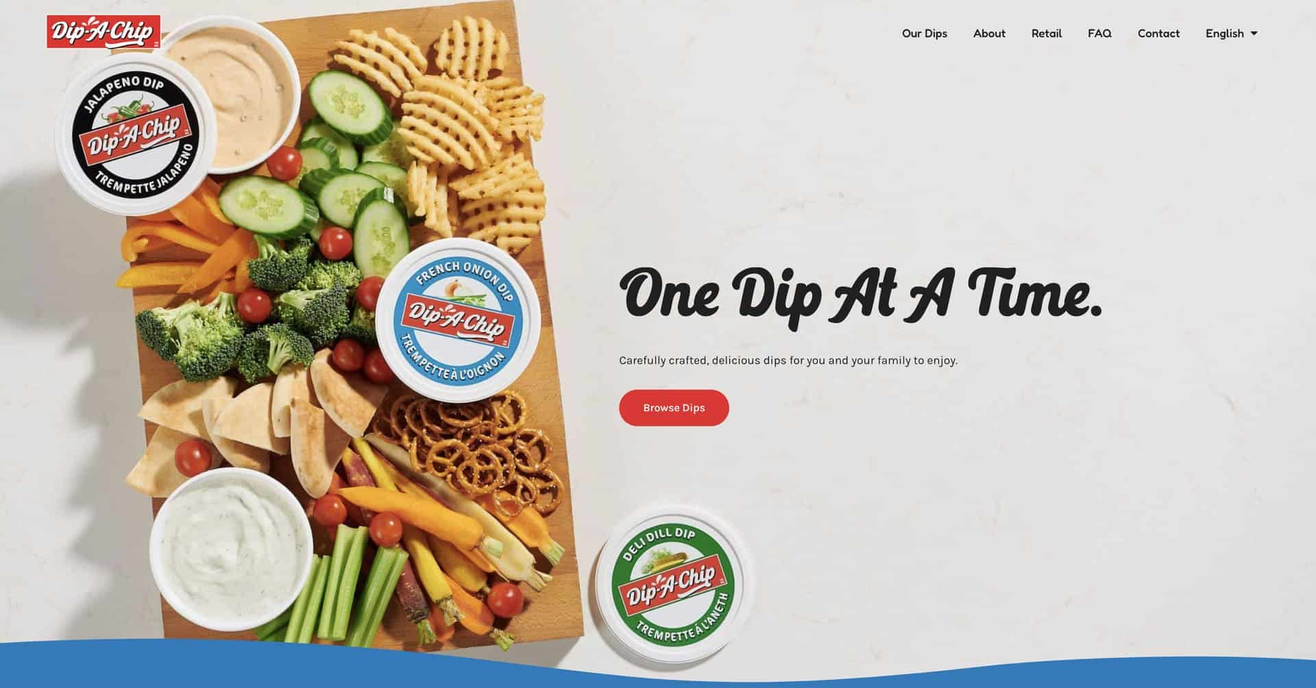
Company Overview: Dip-A-Chip is a classic Canadian dip brand that has been creating delicious, dippable delights for snack time since 1972. With over five decades of experience crafting carefully prepared dips for families across North America, Dip-A-Chip has become a nostalgic favourite while continuing to innovate with new flavours and recipes. From traditional French onion and ranch to creative seasonal varieties, Dip-A-Chip makes dips that bring people together around the snack table – whether it’s game day, family gatherings or everyday snacking moments. This website was designed and developed by Azuro Digital – we’re an industry-leading food and beverage web design agency.
Why Their Website Design is Top Tier:
- Nostalgic Yet Modern Aesthetic: Dip-A-Chip’s website strikes the perfect balance between honouring its heritage since 1972 and maintaining contemporary design standards, using classic colour schemes and friendly typography that feels both trustworthy and approachable while avoiding dated visuals.
- Product-Focused Photography: The site features mouthwatering close-up photography of dips with chips, vegetables and other dippers that immediately communicates texture, freshness and appetite appeal, making visitors crave the products before they even read the descriptions.
- Simple, Intuitive Navigation: The website has straightforward information architecture that makes it easy for visitors to browse dip varieties, find recipes and locate where to buy products without unnecessary complexity or overwhelming choices.
- Family-Friendly Brand Voice: Through warm, inviting copy and relatable snacking scenarios, the site positions Dip-A-Chip as a family tradition that brings generations together, creating emotional connection beyond just product features.
2. Huel
Website: https://huel.com/
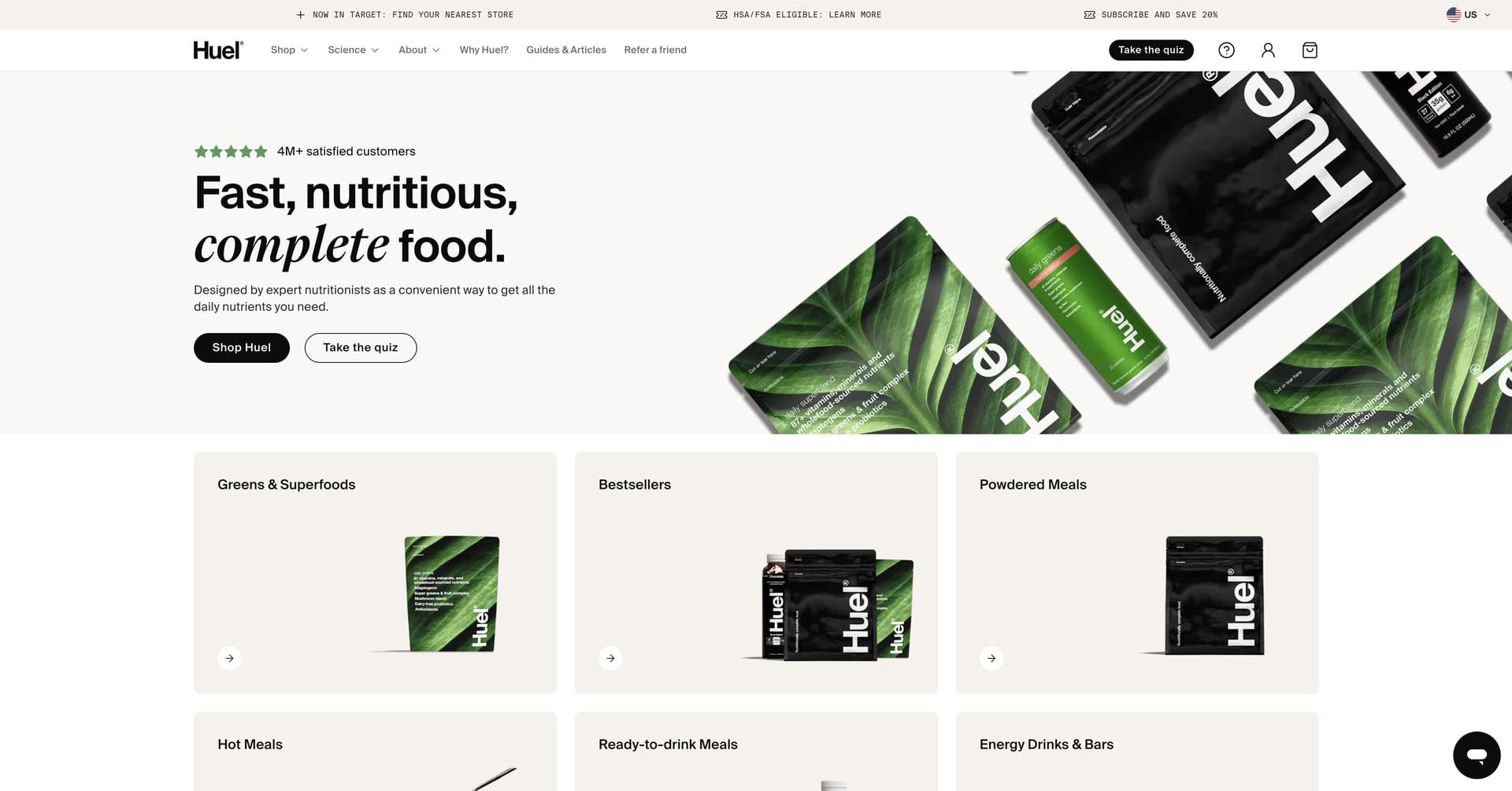
Company Overview: Huel is a British food company that has revolutionized meal replacement with products designed for modern lifestyles. Founded in 2015 with a mission to make nutritionally complete, convenient and affordable food accessible to everyone, Huel has grown to serve millions of customers worldwide with over £200 million in annual revenue. From the original Huel Powder to Ready-to-Drink shakes, Complete Protein, Hot & Savoury meals and snack bars, every Huel product contains all 27 essential vitamins and minerals, protein, carbohydrates, fats and fibre. With 100% vegan ingredients, minimal environmental impact and science-backed nutrition, Huel has become the world’s number one complete food brand.
Why Their Website Design is Top Tier:
- Clean, Minimalist Aesthetic: Huel’s website embraces a refined minimalist design with generous white space, clean typography and a restrained colour palette that conveys scientific credibility and premium quality while remaining approachable and user-friendly.
- Science-Backed Credibility: The site prominently features clinical research, nutritional breakdowns, ingredient transparency and certifications that build trust with health-conscious consumers who want evidence-based nutrition rather than marketing hype.
- Streamlined Conversion Funnel: Huel’s website optimizes the path to purchase through strategic product recommendations, subscription options, bundle offerings and clear value propositions that make it easy for visitors to find the right product and complete checkout seamlessly.
- Social Proof Integration: The website showcases testimonials from athletes, professionals and everyday customers alongside impressive metrics (millions served, countries reached, positive reviews) that demonstrate Huel’s established credibility and customer satisfaction.
3. Graza
Website: https://www.graza.co/
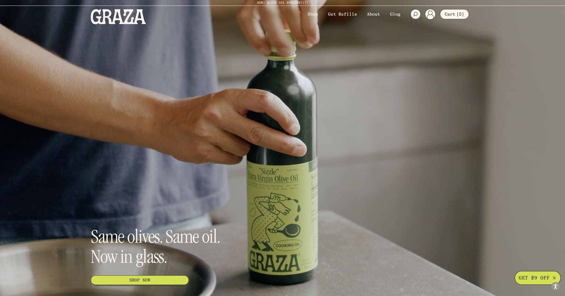
Company Overview: Graza is an olive oil company that has disrupted the industry by packaging premium, single-origin extra virgin olive oil in squeezable bottles designed for everyday use. Founded by Andrew Benin after living in Spain and falling in love with how generously Europeans use quality olive oil, Graza launched in 2022 with two products – “Sizzle” for cooking and “Drizzle” for finishing – both made from 100% Picual olives from Jaén, Spain. By combining restaurant-quality oil with approachable packaging and accessible pricing, Graza challenges the notion that premium olive oil should be used sparingly, encouraging home cooks to use it liberally. The brand has exploded in popularity through word-of-mouth, appearing in Whole Foods, Food & Wine and on countless kitchen counters of food enthusiasts.
Why Their Website Design is Top Tier:
- Playful, Vibrant Visual Identity: Graza’s website has hand-drawn illustrations, bright colours, whimsical copy and an analog aesthetic (reminiscent of film photography) that feels fresh, fun and anti-corporate in a category typically dominated by serious, traditional branding.
- Educational Content: The site includes the “Graz-o-pedia” which explains olive oil terminology, usage tips and the difference between cooking and finishing oils in an entertaining, accessible way that empowers customers to use products confidently.
- Personality-Driven Storytelling: Through quirky product descriptions, behind-the-scenes content and founder narrative, Graza’s website communicates that this is a brand with personality and perspective rather than just another commodity, building emotional connection and brand loyalty.
- Seamless Ecommerce Experience: The website has sophisticated yet approachable ecommerce functionality with bundle options, subscription services, gift sets and smooth checkout to maximize conversions.
4. Impossible Foods
Website: https://impossiblefoods.com/
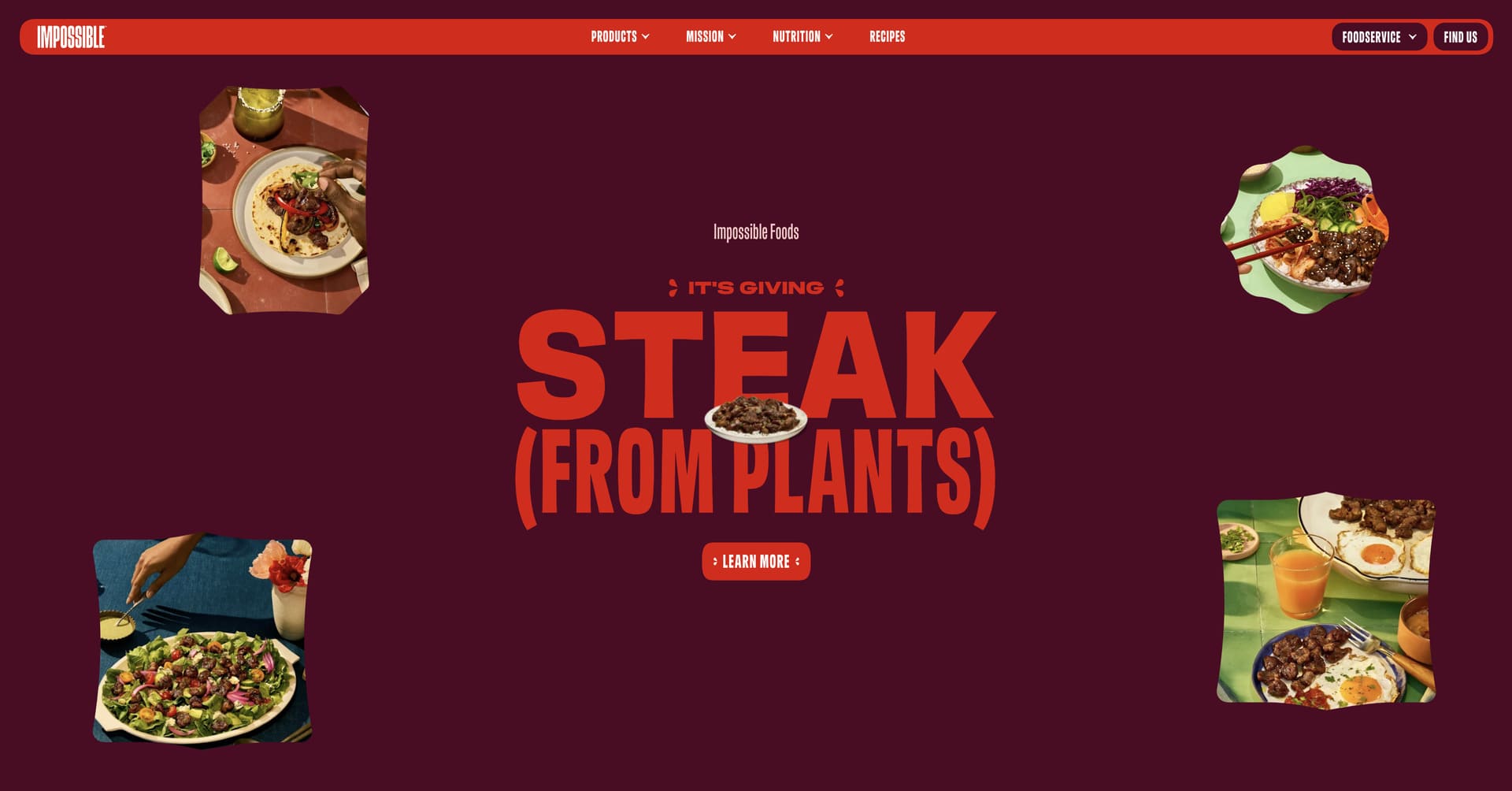
Company Overview: Impossible Foods is the California-based food technology company creating plant-based meat that tastes, cooks and satisfies like meat from animals – with a significantly smaller environmental footprint. Founded in 2011 by Stanford biochemistry professor Dr. Patrick O. Brown, Impossible Foods spent years studying meat at a molecular level to understand how to recreate its sensory experience using plants. The breakthrough came with heme, a molecule found in all living things that gives meat its distinctive taste. Today, Impossible products are available in over 30,000 retail locations and 45,000 restaurants across multiple countries, serving everyone from vegans to dedicated meat-eaters. With products including Impossible Burger, Impossible Sausage, Impossible Chicken Nuggets and more, the company is on a mission to completely replace animals in the food system by 2035.
Why Their Website Design is Top Tier:
- Bold Red Brand Evolution: Impossible Foods’ recent rebrand features a striking red aesthetic that breaks conventions (moving away from expected green/earth tones) and directly appeals to meat-eaters, positioning plant-based products as craveable rather than compromise.
- Carnivore-Focused Messaging: The website speaks directly to meat lovers with messaging like “We’re solving the meat problem with more meat,” using familiar imagery (backyard barbecues, hot dogs) that makes plant-based eating feel inclusive rather than niche or preachy.
- Recipe and Use Case Focus: Rather than just listing products, the site showcases recipes, cooking applications and real-world scenarios that help visitors envision incorporating Impossible products into their actual lives.
- Environmental Impact Transparency: The website clearly communicates the sustainability benefits of choosing Impossible over animal meat through compelling infographics, comparative data and impact metrics that appeal to environmentally conscious consumers.
5. Partake Foods
Website: https://partakefoods.com/
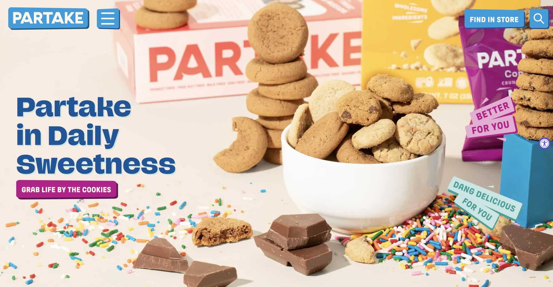
Company Overview: Partake Foods is the allergen-friendly snack company making delicious cookies, baking mixes and crunchy snacks that are free from the top 14 allergens while being gluten-free, vegan and non-GMO. Founded in 2016 by Denise Woodard after her daughter was diagnosed with severe food allergies, Partake Foods was born from the frustration of finding safe, tasty snacks that didn’t compromise on flavour or fun. What started as a mission to create treats her daughter could enjoy has grown into a nationwide brand available in Target, Whole Foods, Sprouts and thousands of stores, bringing joy to families dealing with food allergies, dietary restrictions and anyone seeking cleaner ingredient snacks. With colourful packaging, playful branding and genuinely delicious products, Partake Foods proves that allergy-friendly doesn’t mean taste-free.
Why Their Website Design is Top Tier:
- Inclusive, Joyful Branding: Partake Foods’ website uses bright colours, playful illustrations and celebratory imagery that positions allergen-friendly snacks as fun and delicious rather than restrictive or medicinal, creating positive associations and emotional resonance with families.
- Clear Allergen Communication: The site prominently displays which allergens are excluded (top 14), certifications (gluten-free, vegan, non-GMO) and ingredient transparency, building trust with parents and consumers who need to carefully vet every food purchase for safety.
- Community-Focused Content: The website showcases real customer stories, highlights the founder’s personal journey and creates space for the food allergy community to feel seen and supported, transforming Partake from just a product into a movement.
- Easy Product Discovery: With clear categorization by product type, flavour and use case (snacks, baking, parties), the site makes it simple for visitors to find exactly what they need without overwhelming complexity.
6. Oddbox
Website: https://www.oddbox.co.uk/
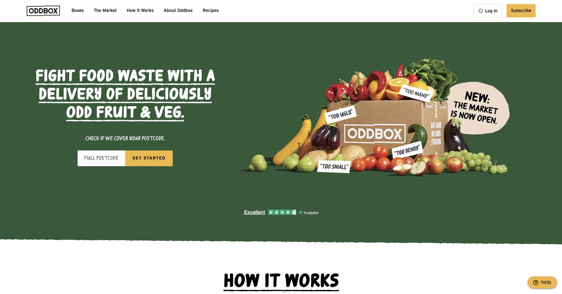
Company Overview: Oddbox is a UK-based fruit and vegetable subscription service on a mission to fight food waste by rescuing “odd” and surplus produce directly from farms. Founded in 2016 as a small social enterprise, Oddbox has grown into a category-defining brand in sustainable food delivery, saving thousands of tonnes of fresh produce from being wasted simply because it doesn’t meet supermarket aesthetic standards. By offering flexible subscription boxes filled with delicious but cosmetically imperfect fruits and vegetables at affordable prices, Oddbox makes sustainable eating accessible to mainstream consumers rather than just hardcore environmentalists. With transparent impact reporting showing exactly how much food each customer has saved, detailed sourcing information and recipe inspiration, Oddbox demonstrates that fighting food waste can be convenient, affordable and delicious.
Why Their Website Design is Top Tier:
- Mission-Forward Design: Oddbox’s website immediately communicates environmental impact through prominent display of food rescued statistics, carbon savings metrics and educational content about food waste, building emotional connection and justifying the subscription model through values rather than just convenience.
- Vibrant, Positive Aesthetic: The site has bright colours, playful illustrations and beautiful photography of “imperfect” produce that celebrates visual quirks rather than hiding them, reframing food waste as interesting and valuable rather than inferior or undesirable.
- Simple Subscription Experience: With straightforward box options, transparent pricing, easy customization and clear delivery information, the website removes barriers to sign-up and makes sustainable food delivery accessible to time-pressed consumers who might otherwise default to traditional supermarkets.
- Recipe and Usage Inspiration: Oddbox provides extensive recipe content, cooking tips and seasonal eating guides that help customers make the most of their boxes, addressing potential concerns about receiving unfamiliar vegetables while building cooking confidence and reducing food waste at home.
7. PepsiCo
Website: https://www.pepsico.com/
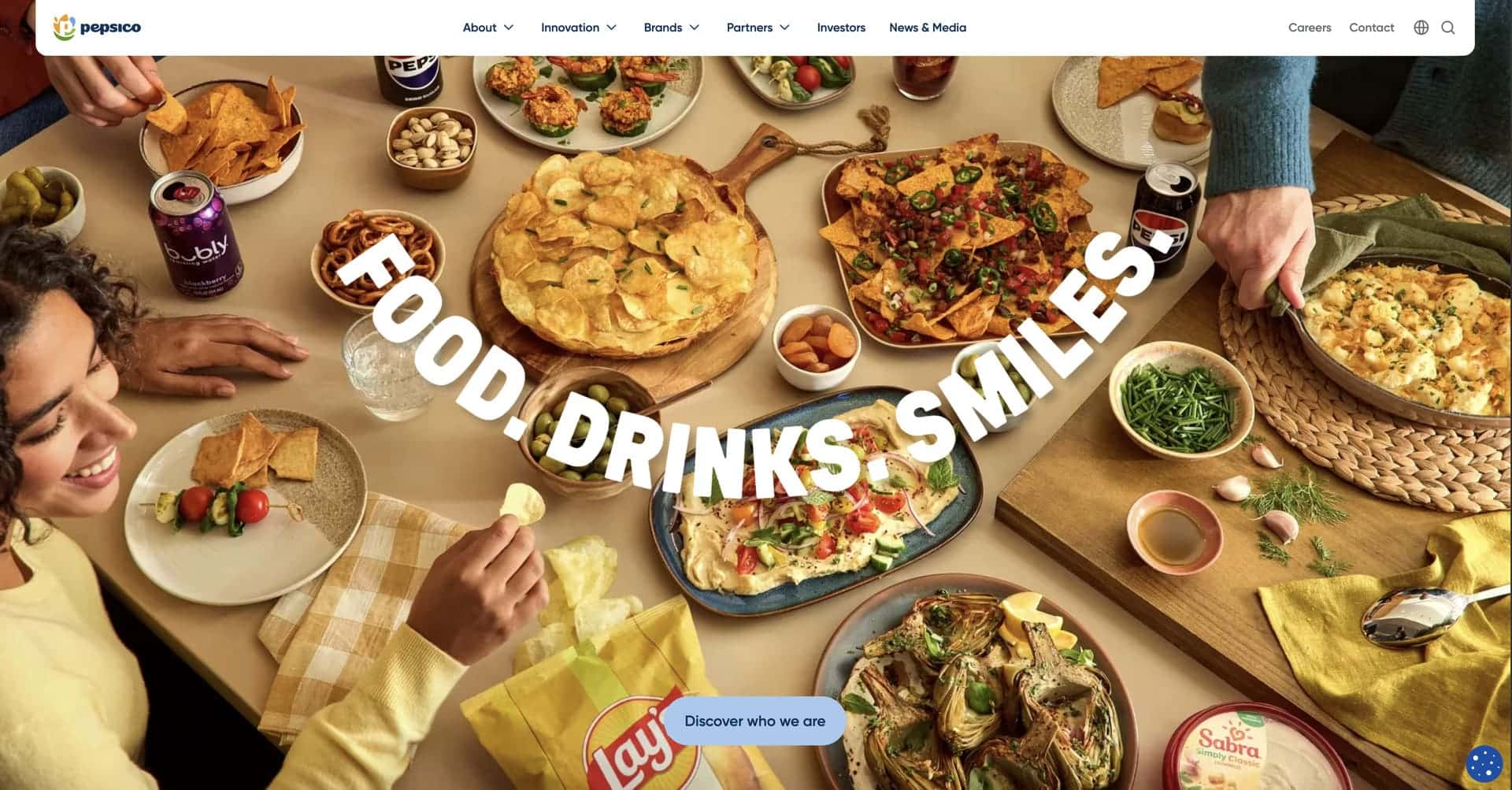
Company Overview: PepsiCo is one of the world’s leading food and beverage companies with a product portfolio generating more than $91 billion in annual revenue. From the iconic Pepsi brand to Lay’s, Doritos, Cheetos, Gatorade, Tropicana, Quaker and hundreds of other beloved brands, PepsiCo products are enjoyed by consumers in more than 200 countries over a billion times per day. Founded through the 1965 merger of Pepsi-Cola and Frito-Lay, PepsiCo has evolved into a purpose-driven company committed to sustainable growth, creating smiles with every sip and bite while supporting communities and protecting the planet. With over 300,000 employees worldwide and operations across the entire food and beverage value chain, PepsiCo represents the scale and reach of modern global food systems.
Why Their Website Design is Top Tier:
- Corporate Sophistication: PepsiCo’s website demonstrates enterprise-grade design with polished layouts, professional photography, sophisticated animations and comprehensive information that reflects the scale and maturity of a Fortune 50 company while remaining approachable.
- Purpose-Driven Messaging: Rather than leading with products, the site prominently features PepsiCo’s sustainability initiatives, diversity commitments, community impact and long-term vision, positioning the company as a responsible corporate citizen rather than just a profit-driven conglomerate.
- Comprehensive Stakeholder Communication: The website serves multiple audiences (consumers, investors, potential employees, media, partners) with dedicated sections for each, demonstrating information architecture that balances competing needs without creating confusion or diluting any single message.
- Visual Brand Portfolio Showcase: The site elegantly presents PepsiCo’s vast brand portfolio through clean categorization, high-quality brand imagery and intuitive navigation that helps visitors understand the company’s breadth without overwhelming them with hundreds of individual products.
8. Sweetgreen
Website: https://www.sweetgreen.com/
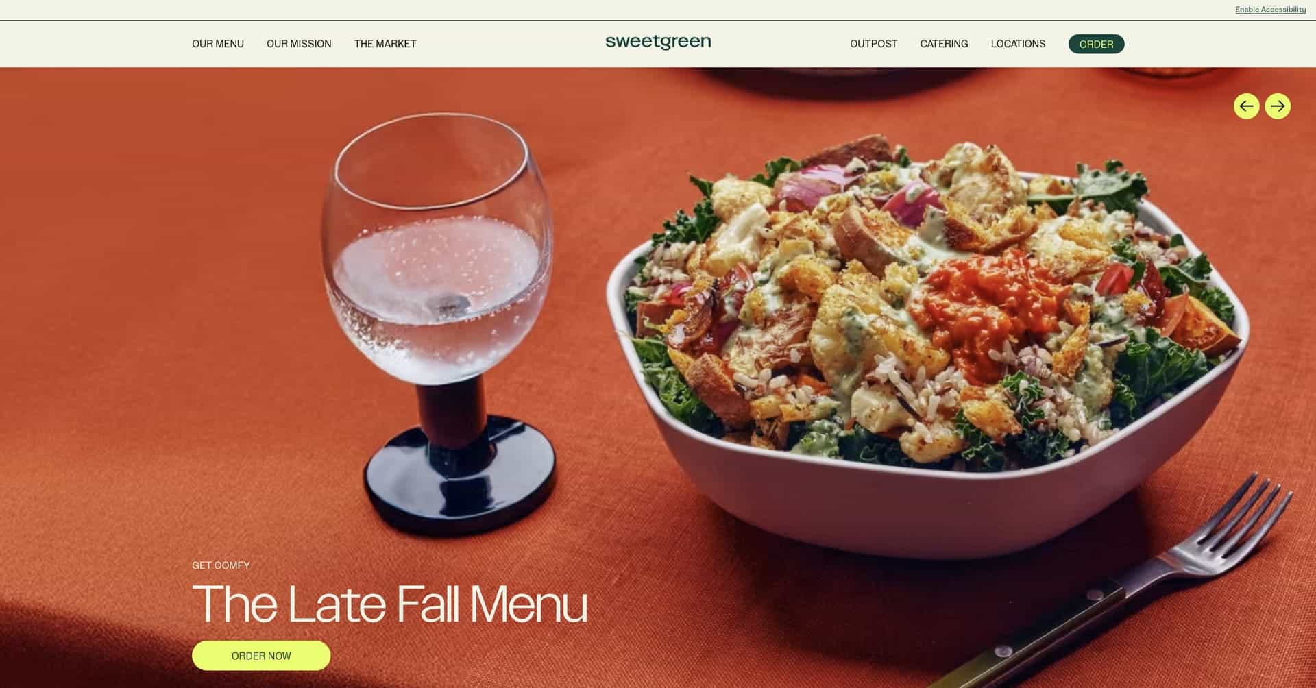
Company Overview: Sweetgreen is the fast-casual restaurant chain revolutionizing healthy eating by serving seasonal salads, grain bowls and plates made with local, organic ingredients. Founded in 2007 by three Georgetown University students – Nicolas Jammet, Nathaniel Ru and Jonathan Neman – frustrated by the lack of healthy food options on campus, Sweetgreen has grown from a 500-square-foot restaurant to over 200 locations across the United States. With a mission to connect people to real food and build healthier communities, Sweetgreen has become beloved by health-conscious consumers who refuse to compromise between convenience and quality. Through direct relationships with farmers, innovative technology and commitment to sustainability (aiming for carbon neutrality), Sweetgreen represents the future of fast food – proving that healthy, delicious and sustainable can coexist at scale.
Why Their Website Design is Top Tier:
- Premium Brand Aesthetic: Sweetgreen’s website has a sophisticated design system featuring custom typography, vintage-inspired illustrations and an earthy colour palette that immediately differentiates it from typical fast-food websites, conveying quality and thoughtfulness while maintaining approachability.
- Seamless Ordering Experience: The site prioritizes the customer journey with an intuitive online ordering system that makes customizing meals effortless, featuring ingredient photography, nutritional transparency, real-time availability and strategic placement of CTAs that drive conversions.
- Lifestyle-Oriented Content: Rather than only displaying food photography, Sweetgreen also showcases real-life moments – people enjoying meals outdoors, friends gathering over bowls, farmers in fields – helping visitors visualize Sweetgreen as part of their daily healthy lifestyle rather than just another restaurant option.
- Sustainability Storytelling: The website prominently features Sweetgreen’s environmental initiatives, carbon neutrality goals, local sourcing practices and community programs, building trust with values-driven consumers and positioning the brand as a force for positive change beyond just selling salads.
9. Oatly
Website: https://www.oatly.com/
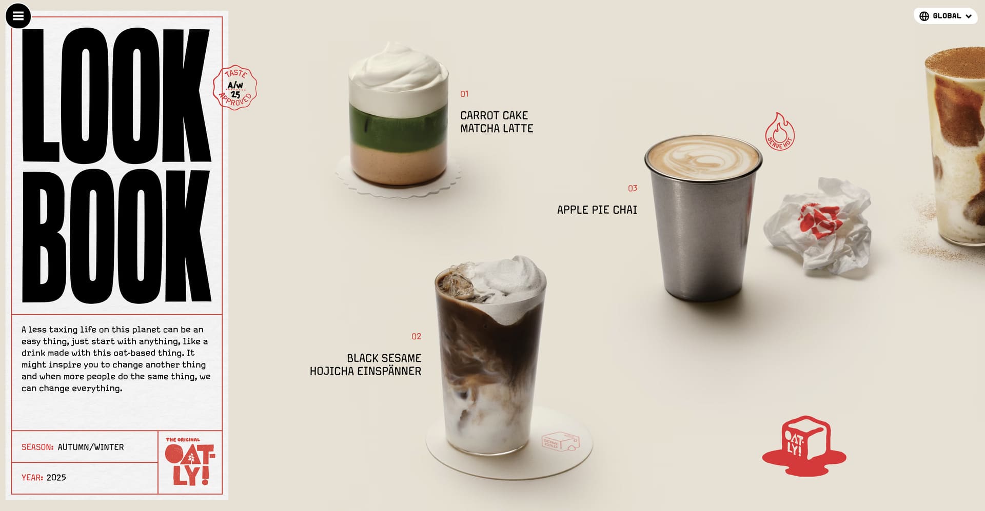
Company Overview: Oatly is a Swedish oat milk company that has transformed plant-based dairy alternatives from a niche health food to a mainstream cultural phenomenon. Founded in the 1990s by university professor Rickard Öste based on research from Lund University, Oatly spent years in relative obscurity before exploding in popularity in the 2010s. Today, Oatly produces oat milk, ice cream, yogurt alternatives and more across 25+ countries, generating over $700 million in annual revenue. With distinctive packaging covered in self-aware copy, sustainability commitments (Oatly calculates and displays the carbon footprint of products) and a brand voice that feels more like an indie magazine than a traditional food company, Oatly has proven that plant-based products can be both environmentally responsible and commercially successful – all while maintaining creative integrity and refusing to take itself too seriously.
Why Their Website Design is Top Tier:
- Innovative, Infinite Sideways Scrolling: Oatly’s website embraces what they call “Infinite Sideways Scrolling” – a deliberately chaotic yet structured approach where the entire homepage scrolls sideways (rather than top to bottom) and loops infinitely, perfectly reflecting the brand’s creative, rule-breaking personality.
- Witty, Self-Aware Copy: The site features Oatly’s signature playful, conversational tone with tangents, asides, humorous disclaimers and self-deprecating humour that makes the brand feel approachable, honest and refreshingly human in a category often dominated by serious sustainability messaging.
- Animation and Delight: Oatly uses subtle animations, micro-interactions and unexpected moments throughout the site that guide attention, create memorable experiences and reflect the brand’s commitment to making plant-based eating enjoyable – all while not overwhelming the user.
- Radical Transparency: The website prominently showcases environmental calculations, sustainability reports, supply chain information and honest communication about challenges, building credibility with eco-conscious consumers while demonstrating that Oatly walks the talk on sustainability commitments.
10. Blue Apron
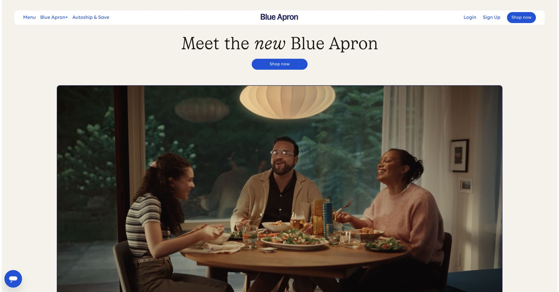
Website: https://www.blueapron.com/
Company Overview: Blue Apron is a meal kit delivery service that pioneered the home cooking revolution by delivering fresh, pre-portioned ingredients and chef-designed recipes directly to customers’ doors. Founded in 2012 by Matthew Salzberg, Ilia Papas and Matt Wadiak, Blue Apron was among the first companies to make restaurant-quality home cooking accessible to everyday people regardless of culinary skill level. By eliminating meal planning, grocery shopping and food waste while teaching cooking techniques through detailed recipe cards, Blue Apron has served millions of meals to hundreds of thousands of customers. With options ranging from classic meal kits to prepared meals, wine pairings and market products, Blue Apron continues evolving to meet changing consumer needs while maintaining its core mission of making home cooking easy, enjoyable and sustainable.
Why Their Website Design is Top Tier:
- Aspirational Food Photography: Blue Apron’s website features stunning, professionally styled food photography that showcases finished dishes in their best light, creating mouthwatering appeal and demonstrating the restaurant-quality results that customers can achieve at home with Blue Apron’s guidance.
- Flexible Plan Presentation: The site clearly explains subscription options, pricing tiers and flexibility (skip weeks, pause, customize meals) in a transparent way that reduces perceived commitment barriers and makes it easy for visitors to find the right plan for their household size and preferences.
- Recipe and Value Preview: Blue Apron allows visitors to browse upcoming menu options, view full recipe cards and understand exactly what they’re getting before subscribing, removing mystery and building confidence in the product through transparency and preview functionality.
- Educational Positioning: Through recipe cards that teach techniques, ingredient spotlights that build food knowledge and cooking tips integrated throughout the site, Blue Apron positions itself as cooking education rather than just convenience, appealing to customers who want to improve their culinary skills.
Key Takeaways for Your Food & Beverage Website Design
After analyzing these outstanding food and beverage website design examples, several universal best practices emerge:
Appetite appeal is paramount. In food and beverage, visual quality directly impacts perceived taste and product quality. Invest in professional food photography, thoughtful styling and imagery that creates desire and emotional connection. Generic stock photos or amateur shots will damage your brand more than help – show your products in appetizing contexts that make visitors hungry and eager to try.
Mobile-first design is essential. With most food and beverage website traffic coming from smartphones, your site must deliver flawless mobile experiences. Test all menus, ordering systems, forms and navigation extensively across iOS and Android devices at various screen sizes.
Brand personality builds emotional connection. In an oversaturated market, having distinctive voice, authentic values and memorable personality differentiate you from competitors. Share your origin story, communicate your sourcing practices and let your unique perspective shine through – authenticity creates loyal advocates rather than one-time customers.
Transparency builds trust immediately. Modern consumers expect clear ingredient lists, honest pricing, nutritional information and sustainability practices. Communicate openly about what’s in your products, where ingredients come from and what your company stands for – transparency overcomes skepticism and builds confidence.
Make conversion seamless. Whether selling products, taking reservations or driving foot traffic, every additional click or form field increases abandonment. Streamline checkout flows, offer guest options, save preferences and remove unnecessary barriers between desire and transaction.
Social proof validates claims. Customer reviews, user-generated content, press mentions and authentic testimonials overcome skepticism far more effectively than marketing claims. Feature social proof strategically near conversion points to address objections when visitors are closest to purchasing.
Sustainability resonates with consumers. Especially among younger demographics, environmental impact, ethical sourcing and corporate values matter deeply. Communicate your commitments clearly with specific actions, certifications and transparent reporting that builds trust with conscious consumers.
To Sum Up
The best food and beverage websites of 2026 prove that exceptional web design is a competitive advantage that directly impacts conversion rates and long-term business growth.
Whether you’re building a snack brand, launching a beverage company, developing a meal delivery service or creating the next generation of food products, your website must reflect the same level of quality, attention to detail and customer focus that you bring to your products. The food and beverage website design examples featured in this article set a high standard, but they also provide a clear roadmap for creating digital experiences that build trust, showcase products beautifully and convert browsers into buyers.
In 2026, the customer journey usually begins online – whether through search or social media. When potential customers land on your food and beverage website, make sure they find a mouthwatering aesthetic, clear navigation, compelling reasons to try your products and an experience that reflects the quality of what you’re offering. Your food and beverage website isn’t just about looking beautiful – it’s about building a sustainable competitive advantage through design that converts visitors into customers and supports profitable growth year after year.
Looking for more food and beverage web design strategies? Check out our top 10 web design tips for food and beverage companies in 2026.
Thinking about outsourcing your food and beverage web design project? Get in touch with our team!

