Having an exceptional fintech website design isn’t just nice to have – it’s absolutely critical for growth, credibility and market differentiation.
The best fintech websites of 2026 go well beyond basic layouts and feature lists. They build immediate trust through premium design and social proof, communicate complex financial concepts with clarity, demonstrate security compliance and create seamless user experiences that convert visitors into customers. Whether you’re launching a neobank, building a payment platform or developing investment technology, these 10 fintech companies demonstrate what world-class fintech web design looks like today.
What Makes a Fintech Website Design Stand Out?
Before diving into our curated examples, it’s essential to understand what separates exceptional fintech website designs from mediocre ones. The most effective fintech websites share several critical characteristics:
Trust and credibility sit at the foundation of every great fintech website – achieved through clean, professional aesthetics, strategic placement of security badges and compliance certifications, transparent communication about data protection and privacy, and prominent display of recognized partners and investors.
Clarity and simplicity help users navigate complex financial products effortlessly – using intuitive navigation, benefit-focused messaging that immediately communicates value, a user journey that reveals complexity only when needed and minimal cognitive load through clean layouts and generous white space.
Impressive visual aesthetic reflects product quality and innovation – incorporating modern design systems with cohesive colour palettes and typography, thoughtful use of animation and micro-interactions to guide users, high-quality product demonstrations and interface previews and mobile-first responsive design that delivers flawless experiences across all devices.
Today’s fintech consumers expect instant access to information, transparent pricing and fee structures, interactive product demonstrations that let them explore functionality, comprehensive security information and compliance details and social proof through customer testimonials, case studies and usage statistics. The fintech website design examples below understand these modern expectations and have created digital experiences that convert curious visitors into loyal customers.
Top Fintech Website Rankings:
1. Vancouver Bitcoin
Website: https://vancouverbitcoin.com/
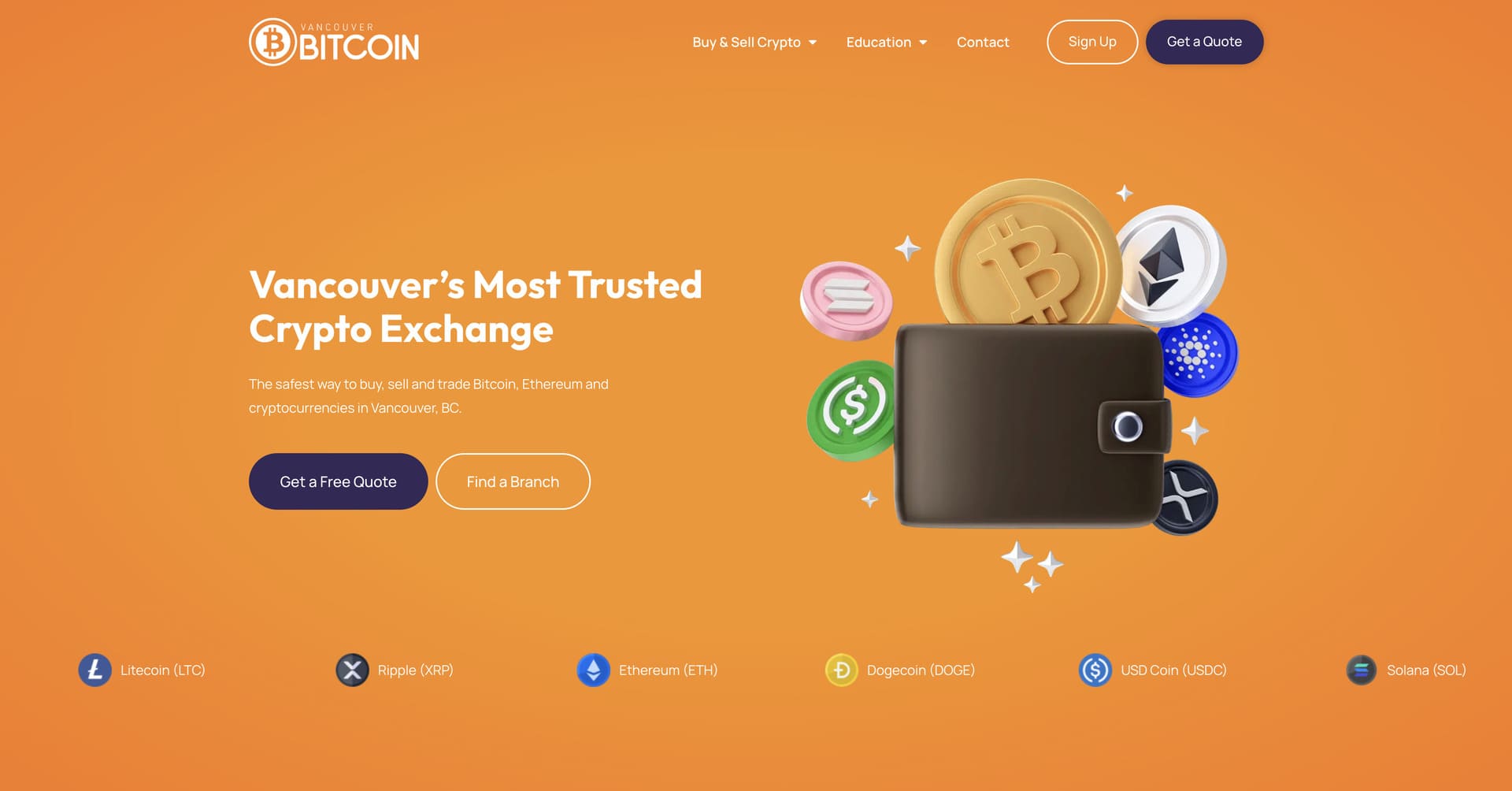
Company Overview: Vancouver Bitcoin is a leading brick-and-mortar cryptocurrency exchange in Canada, offering secure and straightforward crypto buying and selling services with physical retail locations across Vancouver and Calgary. Founded in 2018 by four crypto enthusiasts determined to make digital currencies accessible and trustworthy, Vancouver Bitcoin has processed over 100,000 successful transactions and earned 400+ five-star reviews. Unlike online-only exchanges, Vancouver Bitcoin combines the convenience of digital transactions with the security and personal service of in-person support, allowing customers to buy Bitcoin, Ethereum, Litecoin, XRP, Dogecoin, Solana and USDC using cash, e-transfer or wire transfer with transparent pricing and expert guidance. This website was designed and developed by Azuro Digital – we’re an industry-leading fintech web design agency.
Why Their Website Design is Top Tier:
- Local Trust Emphasis: Vancouver Bitcoin’s website immediately establishes credibility through prominent display of physical branch locations, real customer testimonials with photos and clear emphasis on their seven-year track record with zero client funds lost – directly addressing the trust concerns that plague cryptocurrency exchanges and differentiating them as a safe, established Canadian business.
- Transparent Pricing Communication: The site prominently features their “No Surprises. Just Great Rates” promise with clear explanations of fee structures (3.5%-7.5% depending on quantity) and a guarantee to beat any local competitor’s pricing – building confidence through radical transparency in an industry often criticized for hidden fees and unclear pricing models.
- Multiple Payment Method Showcase: Vancouver Bitcoin effectively organizes content around 3 distinct payment methods – cash, etransfer and wire transfer – with dedicated sections explaining each option’s benefits, processing times and ideal use cases, making it easy for different customer segments to find their preferred transaction method without confusion.
- Educational Support Focus: The website emphasizes Vancouver Bitcoin’s commitment to helping customers understand crypto through detailed FAQs, beginner assistance and explanations of wallet setup and security best practices – positioning them as educators and partners rather than just a transactional service, particularly appealing to crypto newcomers intimidated by technical complexity.
2. Mercury
Website: https://mercury.com/
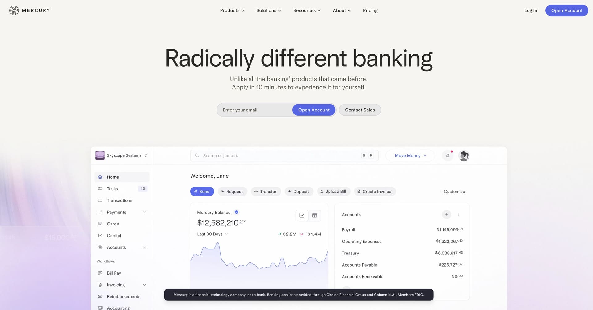
Company Overview: Mercury is a financial technology company that has built banking specifically for startups, offering business checking accounts, savings, credit cards and banking APIs designed around the unique needs of high-growth technology companies. Founded in 2017, Mercury serves thousands of startups backed by leading venture capital firms, providing features like automated bookkeeping, Treasury management for idle cash, team cards with custom spending controls and integrations with the software tools startups actually use – all without minimums, fees or the hassles of traditional business banking.
Why Their Website Design is Top Tier:
- Startup-Focused Aesthetic: Mercury’s website has a sophisticated, modern design system that immediately resonates with startup founders and tech companies through its use of clean layouts, subtle animations and contemporary typography that feels aligned with the innovative companies it serves rather than traditional banking staleness.
- Compelling Product Screenshots: The site features high-quality, thoughtfully composed product screenshots that showcase Mercury’s beautiful interface design and powerful features without requiring lengthy explanations, letting the product’s visual quality speak for itself and building confidence through craftsmanship and attention to detail.
- Founder-to-Founder Messaging: Mercury’s copy speaks directly to founders in their language – discussing burn rates, runway, venture debt and growth metrics – demonstrating deep understanding of the startup journey and positioning Mercury as a partner that understands the specific financial challenges of building a venture-backed company.
- Streamlined Conversion Path: The website maintains laser focus on driving account signups through a remarkably simple conversion flow, removing unnecessary barriers and information while still building confidence through trust signals, recognizable customer logos and clear value propositions that accelerate decision-making.
3. Revolut
Website: https://www.revolut.com/
Company Overview: Revolut is a global financial super app that has revolutionized how millions of people manage money, offering banking, investing, cryptocurrency trading and international payments all in one seamlessly integrated platform. Founded in 2015 and now serving over 50 million users across 38 countries, Revolut has become synonymous with modern digital banking – particularly popular among frequent travellers, freelancers and digitally-native consumers. From fee-free currency exchange to commission-free stock trading to instant global transfers, Revolut’s comprehensive feature set challenges traditional banking while maintaining the security and reliability users demand from financial institutions.
Why Their Website Design is Top Tier:
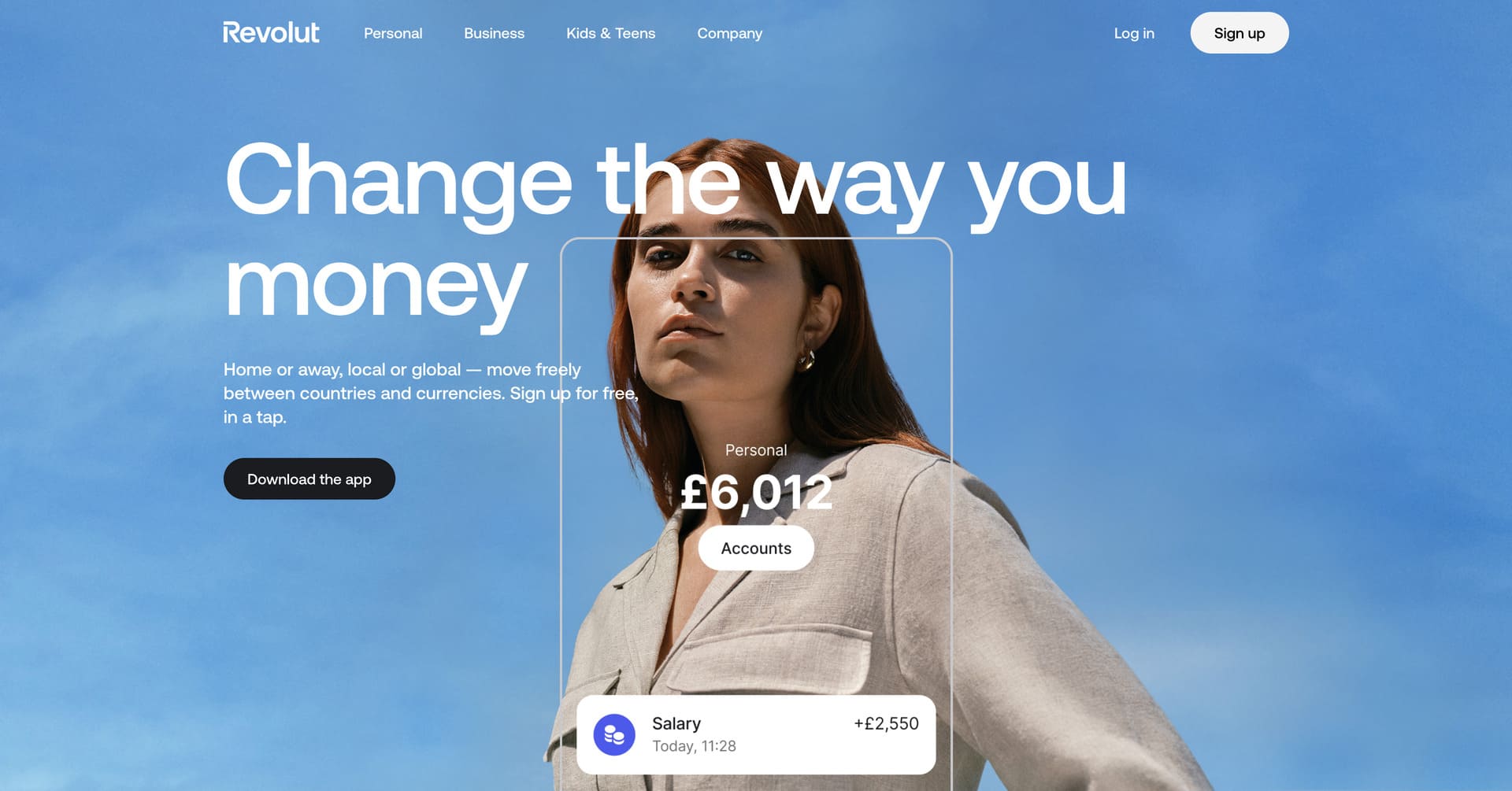
- Bold Visual Identity: Revolut has a distinctive design system featuring bold typography, vibrant gradients and dynamic motion graphics that immediately differentiate it from traditional banking websites, conveying innovation while maintaining the professionalism and trust essential for financial services.
- Feature-Rich Without Overwhelm: Despite offering dozens of features across banking, investing, crypto and business services, Revolut’s website maintains clarity through intelligent information architecture, strategic use of tabs and accordions, and a clear hierarchy that guides visitors to their specific use case without creating decision paralysis.
- Global Market Focus: The website effectively addresses its international audience through clear market selection, localized content and messaging that speaks to global audiences and businesses operating across borders, immediately establishing Revolut’s differentiator as the financial platform built for a borderless world.
- Lifestyle-Oriented Imagery: Rather than generic financial imagery, Revolut showcases real-life scenarios where their product adds value – travellers exploring cities, entrepreneurs building businesses, investors monitoring portfolios – helping visitors visualize themselves using Revolut rather than just understanding what it does functionally.
4. Wealthsimple
Website: https://www.wealthsimple.com/
Company Overview: Wealthsimple is Canada’s leading financial technology company that has revolutionized how millions of Canadians invest, trade, save and manage money through elegantly simple digital tools. Founded in 2014 by Michael Katchen, Wealthsimple has grown from a robo-advisor startup to a comprehensive financial platform serving over 3 million Canadians with more than $100 billion in assets under administration. From managed investment portfolios and commission-free stock trading to high-interest chequing accounts, cryptocurrency trading and tax filing services, Wealthsimple offers sophisticated financial products with the simplicity and accessibility that traditional banks have failed to deliver – all backed by recent $750 million funding at a $10 billion valuation that positions them as a defining force in Canadian financial services.
Why Their Website Design is Top Tier:
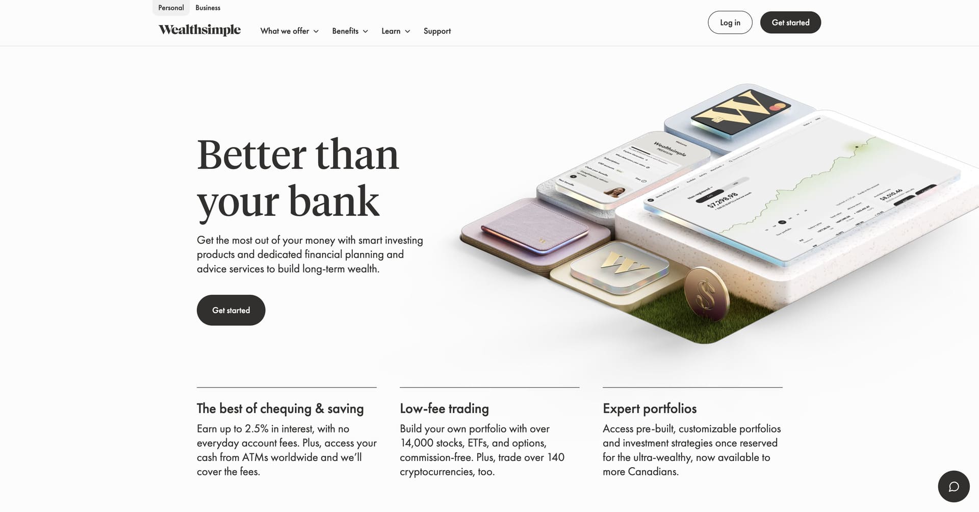
- Sophisticated Minimalism: Wealthsimple’s website has a contemporary, minimalist design aesthetic featuring generous white space, elegant typography and eye-catching 3D animations that convey both professionalism and approachability – creating a visual experience that feels premium and trustworthy while remaining inviting and accessible to everyday Canadians.
- Visual Storytelling: The site strategically uses high-quality lifestyle imagery and videos showing real people in authentic situations – managing finances confidently, planning for the future, enjoying life – that helps visitors emotionally connect with the benefits of financial wellness rather than getting lost in product features and technical specifications.
- Clear Product Segmentation: Despite offering numerous products across investing, trading, saving, spending and tax services, Wealthsimple maintains remarkable clarity through intelligent information architecture that helps each visitor quickly navigate to their specific need – whether they want automated investing, active trading or everyday banking – without creating overwhelm.
- Trust Through Scale: The website prominently showcases Wealthsimple’s impressive metrics – 3 million+ Canadians, $100+ billion in assets, $1 million in eligible coverage – building immediate credibility through demonstrated scale and regulatory compliance while reinforcing that visitors are joining an established, trusted platform rather than experimenting with an unproven startup.
5. Ramp
Website: https://ramp.com/
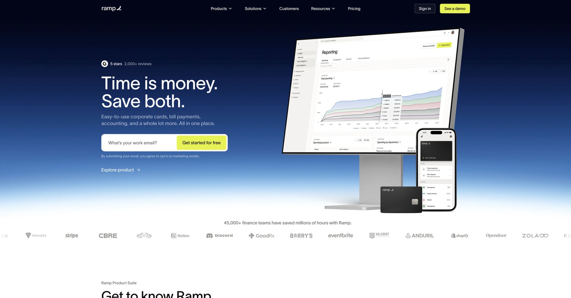
Company Overview: Ramp is a finance automation platform that helps companies save time and money through corporate cards, expense management, bill payments and intelligent insights powered by machine learning. Founded in 2019, Ramp has become the fastest-growing corporate card and spend management platform, serving thousands of companies that collectively save an average of 5% on expenses through Ramp’s automated controls, real-time visibility and intelligent recommendations. By closing books faster, reducing manual work and helping finance teams operate strategically rather than administratively, Ramp has redefined what modern finance operations should look like.
Why Their Website Design is Top Tier:
- Data-Driven Messaging: Ramp’s website prominently features compelling statistics and customer results – time saved, expenses reduced, finance hours reclaimed – building confidence through quantifiable outcomes rather than vague benefit claims and immediately establishing credibility through specific, verifiable customer success stories.
- Product Demonstration Focus: The site uses high-quality product videos and interactive demonstrations that show rather than tell, allowing visitors to see Ramp’s intelligent automation, intuitive interface and powerful analytics in action rather than trying to imagine how features work from bullet-pointed descriptions.
- Clean, Modern Minimalism: Ramp has a remarkably clean design aesthetic that lets content breathe through generous white space, clear typography and a restrained colour palette, creating a sophisticated visual experience that conveys the simplicity and clarity that Ramp brings to historically complex financial operations.
- ROI Calculator Integration: The website features strategic placement of ROI calculators and savings estimators that help prospects quantify Ramp’s potential value for their specific situation, removing abstract considerations and making the business case concrete and personalized based on company size and spending patterns.
6. Stripe
Website: https://stripe.com/
Company Overview: Stripe is the financial infrastructure platform that powers internet commerce, processing hundreds of billions of dollars annually for millions of businesses worldwide. Founded in 2010 by brothers Patrick and John Collison, Stripe has become the backbone of online payments for everyone from ambitious startups to Fortune 500 companies like Amazon, Shopify, Google and Salesforce. Beyond payment processing, Stripe offers a comprehensive suite of financial services including billing, revenue optimization, corporate cards, banking-as-a-service and fraud prevention – all built on elegant APIs that developers actually enjoy using.
Why Their Website Design is Top Tier:
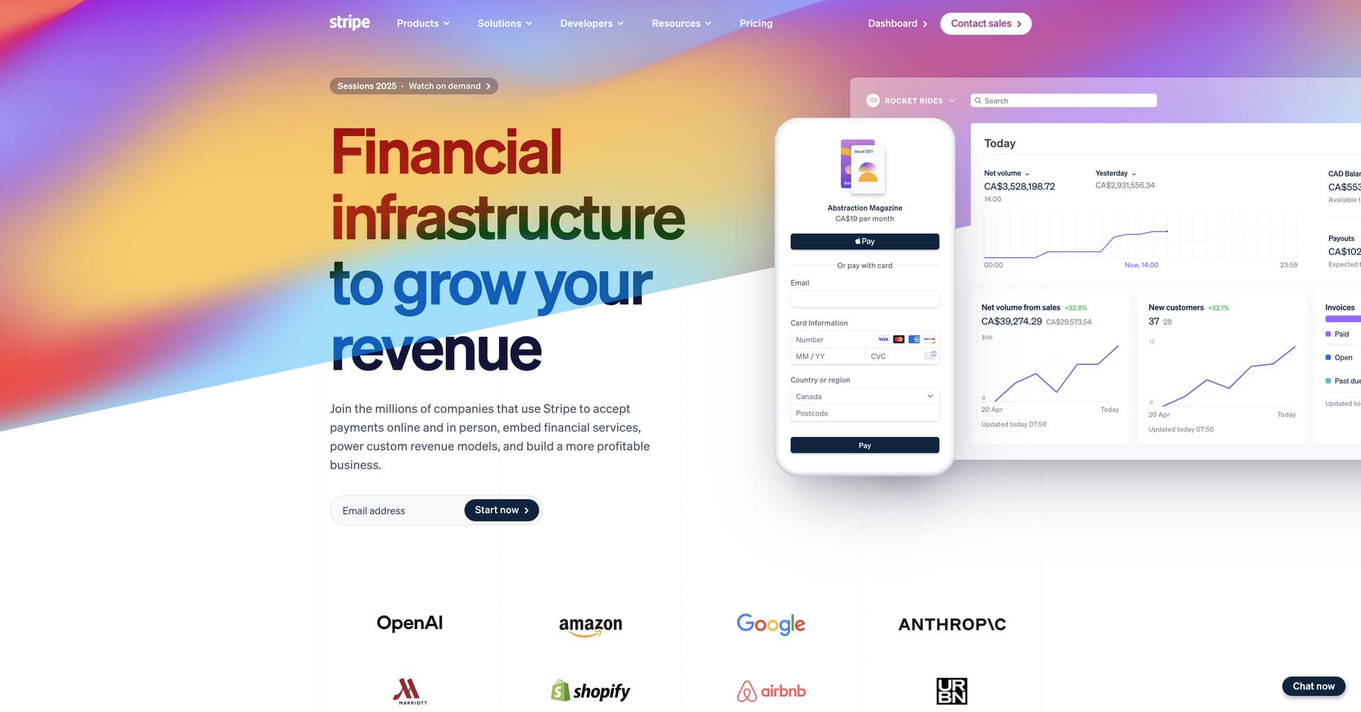
- Mesmerizing Gradient Animations: Stripe’s homepage features continuously flowing gradient animations that seamlessly transition through complementary colours – blues, purples, pinks, yellows and oranges – creating an instantly memorable visual experience that conveys technical sophistication and forward-thinking innovation.
- Developer-Focused Content Strategy: Stripe brilliantly balances technical depth with accessibility, using clear code snippets and API examples throughout the site that speak directly to developers while remaining approachable for business decision-makers evaluating payment solutions for their companies.
- Strategic Product Showcase: Rather than overwhelming visitors with every feature and capability, Stripe uses elegant animations to reveal product depth gradually, keeping users engaged while building understanding of the platform’s comprehensive nature and global scale.
- Trust Through Enterprise Credibility: Stripe strategically showcases recognizable customer logos from industry leaders like Amazon, Shopify and Salesforce throughout the site, combined with impressive scale metrics and detailed case studies that immediately establish credibility and demonstrate that Stripe powers the world’s most demanding businesses – making it the obvious choice for companies of any size.
7. Wise
Website: https://wise.com/
Company Overview: Wise (formerly TransferWise) is the global technology company that has transformed international money transfers by offering the real exchange rate with low, transparent fees. Founded in 2011 by Kristo Käärmann and Taavet Hinrikus, Wise now moves over £10 billion every month for more than 16 million customers worldwide. By using local bank accounts and clever routing rather than traditional correspondent banking, Wise dramatically reduces the cost of sending money internationally while providing unmatched speed and transparency – serving individuals, freelancers, businesses and financial institutions who need to move money across borders efficiently.
Why Their Website Design is Top Tier:
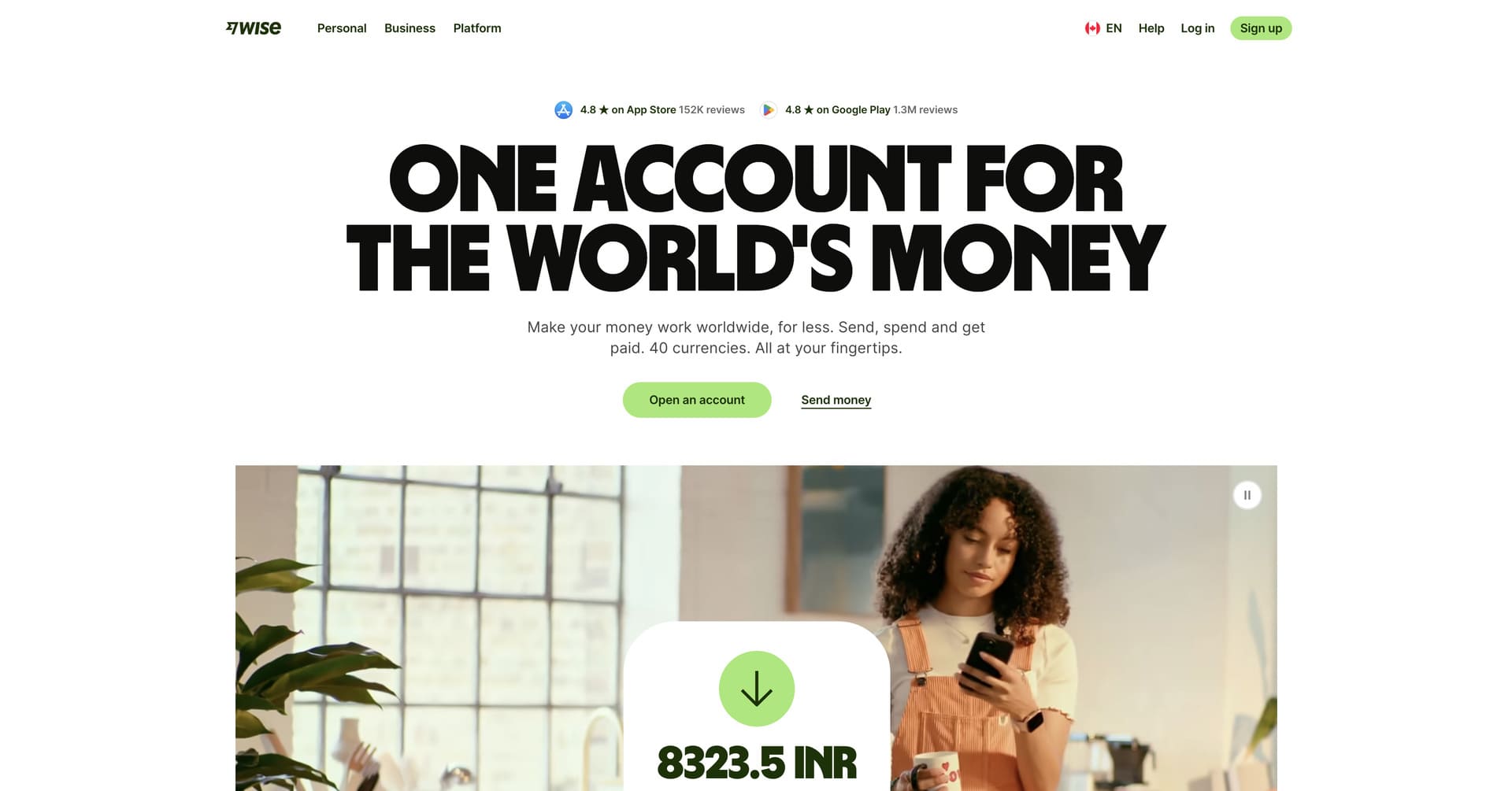
- Transparency-Focused Design: Wise’s website embodies its brand promise of transparency through clear, upfront pricing calculators on the homepage, honest messaging about how traditional banks hide fees in exchange rates and straightforward navigation that never obscures information – building trust through radical honesty rather than marketing speak.
- Calculator-First Experience: The homepage immediately features an interactive currency calculator that lets visitors see exactly how much they’ll pay and how much the recipient will receive in real-time, removing friction from the consideration phase and demonstrating Wise’s confidence in its competitive pricing and value proposition.
- Clean Aesthetic: The website has a minimalist design philosophy with generous white space, simple colour palette and clear typography that conveys efficiency, trustworthiness and straightforward functionality – perfectly aligned with Wise’s mission to simplify the unnecessarily complex world of international money transfers.
- Speed and Efficiency Communication: Through strategic use of animations showing real-time transfers, customer testimonials emphasizing speed and clear timing guarantees, Wise effectively communicates that they’re not just cheaper than traditional methods – they’re also faster, more reliable and easier to use than any alternative in the market.
8. Plaid
Website: https://plaid.com/
Company Overview: Plaid is the infrastructure layer that connects financial applications to bank accounts, enabling secure data sharing between consumers, their financial institutions and the fintech apps they love. Founded in 2013 by Zach Perret and William Hockey, Plaid has become essential infrastructure for the fintech ecosystem, powering applications like Venmo, Robinhood, Chime and thousands of others. Connecting to over 12,000 financial institutions across North America and Europe, Plaid provides the APIs that make modern financial experiences possible – from instant account verification to real-time balance checks to seamless payment initiation.
Why Their Website Design is Top Tier:
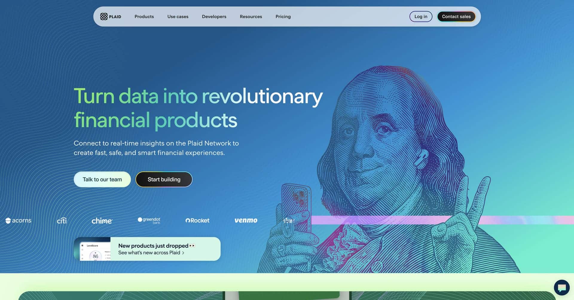
- Playful Creative Elements: Plaid’s website features Benjamin Franklin holding an iPhone in the hero section – a compelling visual metaphor that bridges traditional finance and modern technology while immediately communicating what Plaid does through imagery rather than lengthy explanations, making the abstract concept of financial infrastructure instantly tangible.
- Smooth Micro-Interactions: The site includes interactive elements like Benjamin Franklin winking when you hover over certain CTAs, creating memorable moments that humanize financial technology while demonstrating Plaid’s attention to user experience details and personality-driven brand identity.
- Developer-Friendly Documentation: The website seamlessly integrates code examples, API documentation and technical specifications without overwhelming non-technical visitors, striking the perfect balance between serving engineering teams who will implement Plaid and business stakeholders who make purchasing decisions.
- Network Effect Visualization: Plaid effectively showcases its scale through statistics and partner logos, building immediate credibility by demonstrating that visitors are joining an established ecosystem that connects millions of users with thousands of financial institutions daily across multiple countries.
9. Cash App
Website: https://cash.app/
Company Overview: Cash App is the mobile payment service developed by Block (parent company of Square) that has transformed how millions of Americans send money, invest and bank. Launched in 2013 as a simple peer-to-peer payment app, Cash App has evolved into a comprehensive financial platform offering direct deposits, debit cards, Bitcoin trading, stock investing, Cash App Pay for merchants and business features – all accessible through a beautifully simple mobile interface. With over 50 million monthly active users, Cash App has become especially popular among younger consumers who appreciate its speed, simplicity and modern approach to personal finance.
Why Their Website Design is Top Tier:
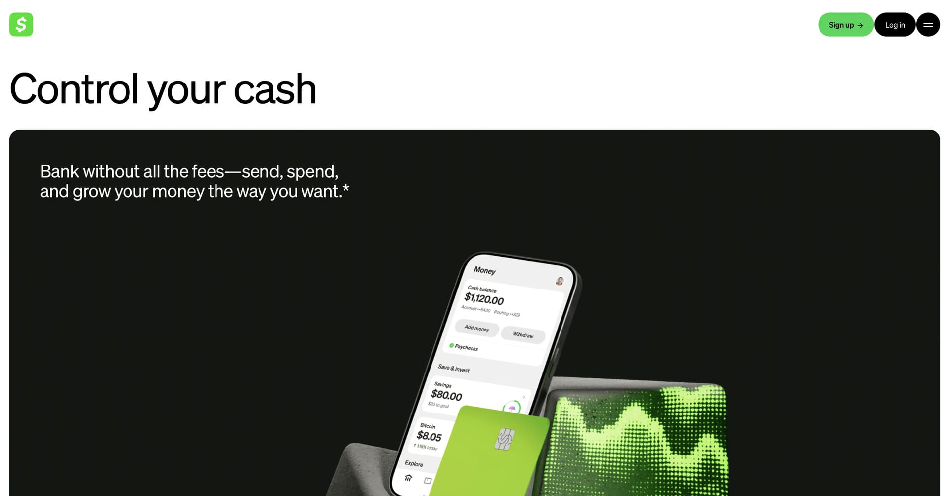
- Mobile-First Presentation: Cash App’s website perfectly mirrors its mobile-first product strategy, featuring prominent smartphone mockups, thumb-sized UI elements in demonstrations and messaging that emphasizes the app’s speed and simplicity – immediately setting expectations that this is designed for on-the-go financial management.
- Bold, Confident Branding: The site has Cash App’s distinctive green colour prominently throughout, using bold typography, high-contrast design elements and confident, straightforward messaging that cuts through financial jargon to speak to users in plain language about what the app actually does and why it matters.
- Social Payment Emphasis: Cash App highlights its social features – Cashtags, public profiles, payment sharing – that have helped it become more than a utility and instead a social platform for money, differentiating it from competitors and appealing to the network effects that drive viral adoption and sustained engagement.
- Quick Start Focus: The website maintains relentless focus on driving app downloads through clear CTAs, minimal friction and straightforward value propositions, understanding that the website’s primary job is getting users to download the app rather than trying to replicate the full experience in the browser.
10. Brex
Website: https://www.brex.com/
Company Overview: Brex is an AI-powered spend management platform that helps companies of all sizes control expenses, manage corporate cards, automate reimbursements and gain visibility into spending. Founded in 2017 by Henrique Dubugras and Pedro Franceschi, Brex started by offering credit cards to startups without requiring personal guarantees, and has since evolved into a comprehensive financial operations platform serving companies from early-stage startups to large enterprises. With automated expense management, integrated travel booking, bill pay and powerful analytics, Brex consolidates what used to require multiple vendors into a single, seamless platform.
Why Their Website Design is Top Tier:
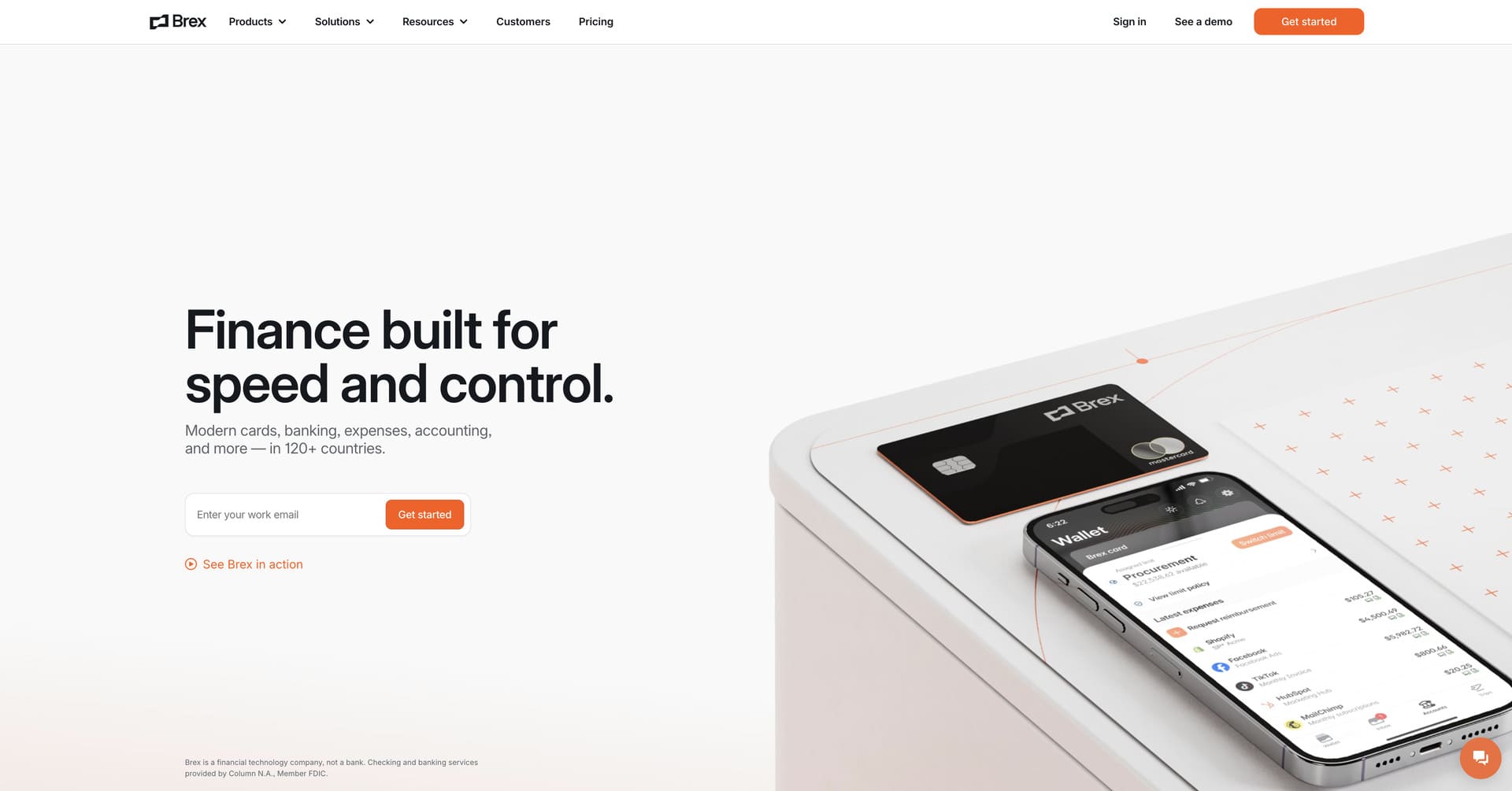
- Enterprise-Grade Polish: Brex’s website conveys sophistication and reliability through its meticulously polished design system – featuring consistent spacing, stunning typography, professional photography and smooth animations that signal this is enterprise-ready software built for serious companies managing significant capital.
- Benefit-Focused Hierarchy: Rather than leading with features, Brex organizes content around the problems it solves – reducing administrative burden, preventing fraud, gaining spending visibility, improving cash flow – helping visitors immediately understand the tangible business value rather than just what the product does technically.
- Segmented User Journeys: The website brilliantly creates dedicated pathways for different company sizes and use cases – startups, small businesses, enterprises, ecommerce – ensuring each visitor segment encounters messaging, case studies and features relevant to their specific situation rather than wading through irrelevant information.
- Motion Design Excellence: Brex uses subtle animations and micro-interactions throughout the site that enhance understanding and create delight without feeling unnecessary – every animation serves a purpose, whether revealing information, demonstrating product functionality or simply adding polish to the overall experience.
Key Takeaways for Your Fintech Website Design
After analyzing these outstanding fintech website design examples, several universal best practices emerge that your fintech company should implement:
Trust trumps cleverness every time. In financial services, clarity, security and credibility matter infinitely more than creative design gimmicks. Your website must immediately communicate that you’re trustworthy, regulated, secure and reliable – use professional aesthetics, prominent security badges, clear privacy policies and recognized customer logos to build confidence from the first impression.
Show the product, don’t just describe it. High-quality product screenshots, interactive demos, real interface previews and walkthrough videos are exponentially more convincing than feature bullet points. Help visitors visualize themselves using your product through realistic demonstrations that showcase actual functionality rather than abstract benefit claims that require imagination.
Speed matters more than you think. Website performance directly impacts conversion rates, SEO rankings and user trust in financial services. Optimize images aggressively, minimize JavaScript, leverage browser caching and use modern hosting infrastructure to ensure your fintech website loads in under two seconds across all devices and connection speeds.
Strategic social proof placement. Customer logos from recognized brands, specific quantitative results, detailed case studies and authentic video testimonials build credibility far more effectively than generic marketing claims. Place social proof strategically near conversion points – signup forms, pricing pages, demo requests – to overcome final objections when visitors are closest to converting.
Animation should enhance, not distract. Motion design and micro-interactions can guide attention, demonstrate functionality and create delight – but only when used purposefully and sparingly. Every animation should serve a clear purpose, load quickly and never impair usability or accessibility.
Design reflects product quality. Your website design sets expectations for your product experience. A polished, professional, thoughtfully crafted website signals that your fintech product is equally well-built, while a generic template or dated design suggests your product might be similarly unremarkable – invest in design as a competitive differentiator.
To Sum Up
The best fintech websites of 2026 prove that exceptional web design is a competitive advantage that directly impacts conversion rates, customer acquisition costs and long-term business growth in an increasingly crowded fintech marketplace.
Whether you’re building a neobank, launching a payment platform, developing investment technology or creating the next generation of financial infrastructure, your website must reflect the same level of innovation, attention to detail and user-focus that you bring to your product. The fintech website design examples featured in this article set a high standard, but they also provide a clear roadmap for creating digital experiences that build trust, communicate value and convert visitors into customers.
In 2026, the customer journey often begins with a Google search (or AI search). When potential customers land on your fintech website, make sure they find confidence, clarity and a compelling reason to sign up for your product or request a demo. Your fintech website isn’t just about looking modern – it’s about converting visitors into customers, and the design aesthetic is only one part of the equation.
Looking for more fintech web design strategies? Check out our top 10 web design tips for fintech companies in 2026.
Thinking about outsourcing your fintech web design project? Get in touch with our team!


