The best nonprofit websites create emotional connections, inspire action and make it effortless for supporters to contribute to causes they believe in.
Nonprofit organizations fiercely compete for attention. Your website needs to stand out instantly, communicate your mission clearly and convert visitors into donors, volunteers or advocates.
In this article, we’re showcasing the 10 best nonprofit websites of 2026 – organizations that have mastered the art of digital storytelling, user experience and conversion-focused design. These aren’t just pretty websites – they’re strategic tools that drive measurable results for important causes.
What Makes a Nonprofit Website Design Stand Out?
Before we explore our top picks, let’s establish what separates exceptional nonprofit web design from the rest. The best nonprofit websites share several critical characteristics that work together to create compelling digital experiences.
Emotional storytelling is paramount. Great nonprofit website designs use powerful imagery, authentic stories and compelling narratives to connect with visitors on a human level. They show – not just tell – the impact of their work through visual storytelling that resonates emotionally.
Clear calls to action guide visitors toward meaningful engagement. Whether it’s donating, volunteering, signing a petition or sharing content, the best nonprofit websites make it crystal clear what action visitors should take next. These CTAs appear strategically throughout the site without overwhelming the user experience.
Transparency and trust signals build credibility. Award-winning nonprofit websites prominently display their financial information, impact metrics and success stories. They use trust badges, testimonials and third-party validation to reassure visitors that their contributions will be used effectively.
Mobile-optimized experiences are non-negotiable. With most website traffic coming from mobile devices, the best nonprofit websites deliver seamless experiences across all screen sizes. This includes simplified donation processes specifically designed for on-the-go supporters.
Visual impact captures attention immediately. Whether through stunning photography, compelling video content or innovative design elements, exceptional nonprofit websites create an instant impression that communicates the organization’s mission and values.
Now, let’s explore the nonprofit websites that exemplify these principles and set the standard for nonprofit web design excellence in 2026.
Top Nonprofit Website Rankings:
1. The National Organization of Black Law Enforcement Executives (NOBLE)
Website: https://noblenational.org/
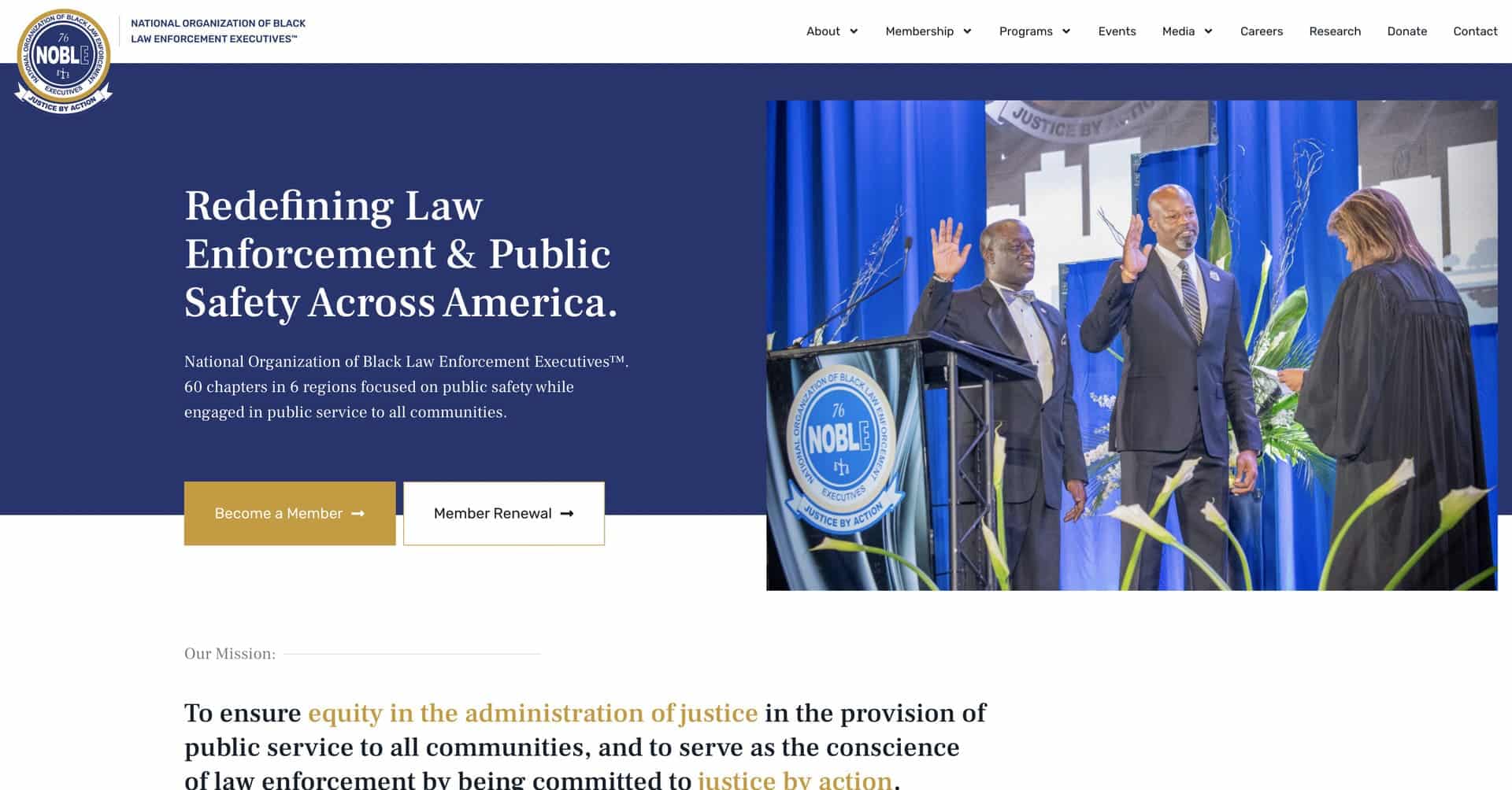
Organization Overview: The National Organization of Black Law Enforcement Executives (NOBLE) is a nonprofit organization that serves as the conscience of law enforcement by promoting justice, equity and excellence in the administration of justice. Founded in 1976, NOBLE consists of over 4,800 members across 60 chapters representing chief executive officers and command-level law enforcement officials from federal, state, county and municipal agencies. This website was designed and developed by Azuro Digital – we’re an award-winning nonprofit web design agency.
Why Their Website Design is Top Tier:
- Mission-driven homepage content – The website immediately establishes NOBLE’s purpose with bold headline typography stating “Redefining Law Enforcement & Public Safety Across America” and a clear mission statement, creating instant clarity about the organization’s role as a unified voice for black law enforcement executives.
- Impact metrics visualization – The site features prominently displayed statistics (4,800+ members, 60 chapters, 6 regions, 1,000 communities reached) in a clean, scannable format that quickly communicates scale and reach while building credibility with potential members and supporters.
- Authentic member testimonial showcase – The website incorporates extensive quotes from diverse members including chapter presidents, regional members and police chiefs, using real names, titles and photographs to create genuine human connections and demonstrate the organization’s meaningful impact on law enforcement professionals.
- Clear program information – Key initiatives like the CEO Mentoring Program, Law & Your Community youth program and Collaborative Reform Initiative are presented with clear descriptions and visual hierarchy, making it easy for different stakeholder groups (aspiring law enforcement leaders, youth, communities and agencies) to understand relevant offerings.
2. Giving Kitchen
Website: https://givingkitchen.org/
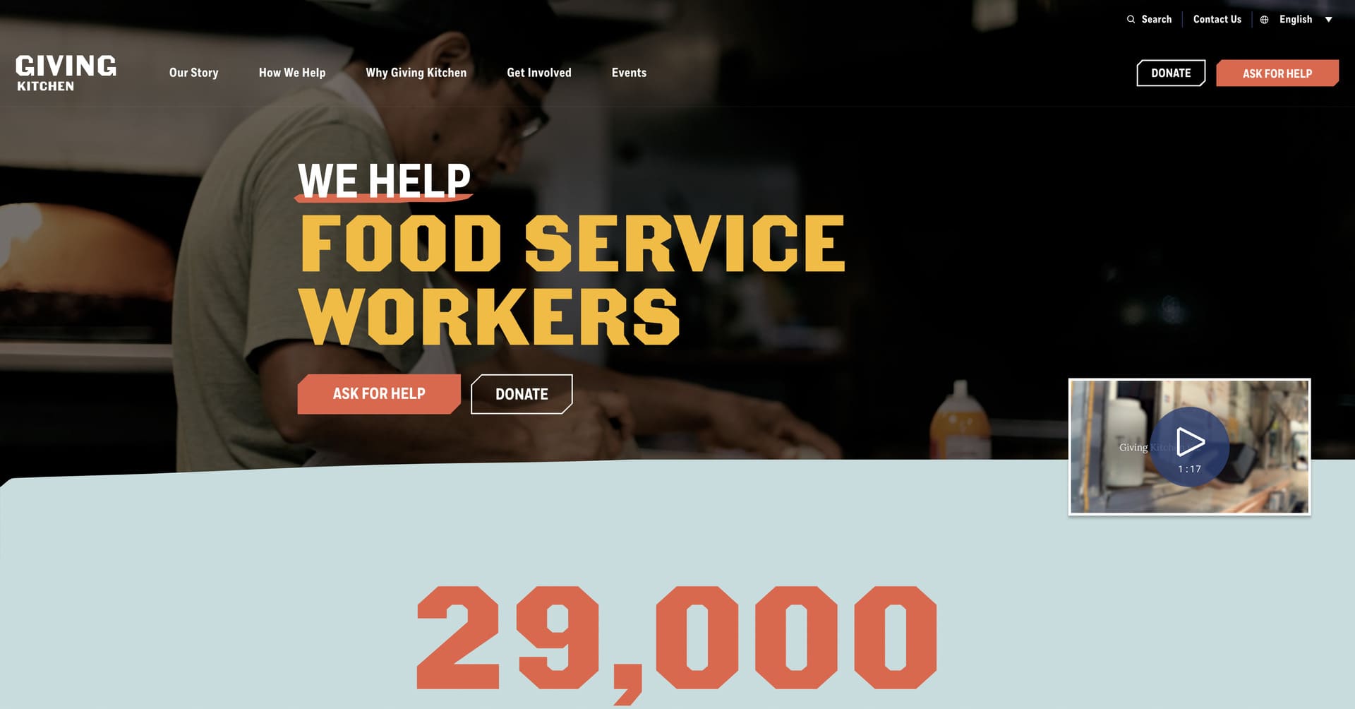
Organization Overview: Giving Kitchen is a nonprofit organization that provides emergency assistance to food service workers facing crises through financial support and community resources. Winner of a WebAward for Best Nonprofit Website, this organization has served over 14,000 food service workers since its founding in 2013.
Why Their Website Design is Top Tier:
- Community-focused branding – The warm colour palette, approachable typography and restaurant-industry imagery creates an inviting atmosphere that reflects the supportive, tight-knit nature of the food service community they serve.
- Emotional authenticity – The website features real stories from food service workers they’ve helped, using authentic photography and testimonials that create genuine emotional connections without feeling exploitative or overly sentimental.
- Compelling content and first impression – The homepage immediately communicates who they serve and how they help, with bold typography and mission-driven messaging that resonates with both food service workers seeking assistance and potential donors looking to support the hospitality community.
- Streamlined dual-audience navigation – The site brilliantly serves two distinct audiences (workers needing help and donors wanting to give) with clear pathways for each group, making it easy for visitors to find exactly what they need based on their relationship to the organization.
3. charity: water
Website: https://www.charitywater.org/
Organization Overview: charity: water is a nonprofit organization dedicated to bringing clean and safe drinking water to people in developing countries. The organization has funded over 100,000 water projects, providing clean water to more than 14 million people across 29 countries.
Why Their Website Design is Top Tier:
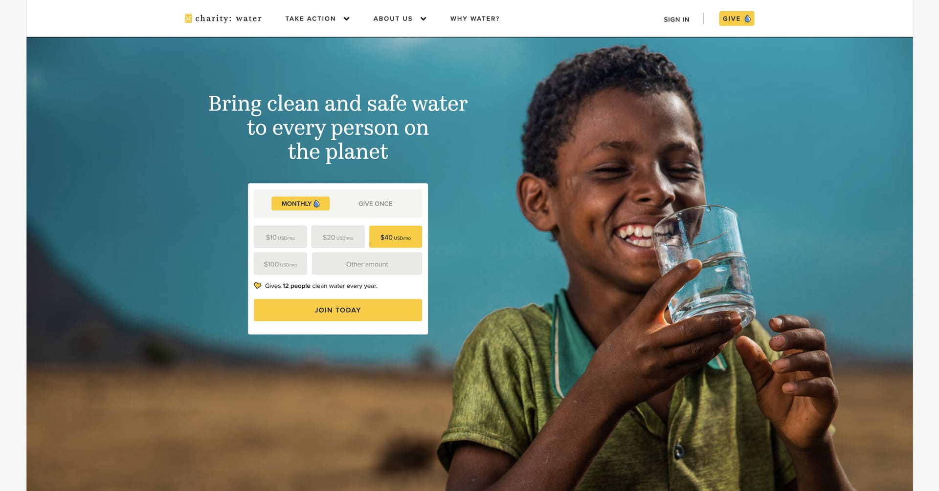
- Stunning visual storytelling – The website utilizes high-quality images, compelling video content and vibrant colour schemes that create an immediate emotional impact, showcasing both the problem of water scarcity and the transformative power of clean water access.
- Radical transparency – charity: water sets the gold standard for nonprofit transparency with their interactive project maps, real-time donation tracking and detailed impact reports that show donors exactly where their money goes and the specific communities they’ve helped.
- Seamless donation experience – The giving process is beautifully designed with clear impact statements (like “$40 per month provides 12 people with clean water each year”), pre-set donation amounts and secure payment options that reduce friction and inspire confidence.
- Social proof integration – The website strategically showcases donor stories, campaign statistics and community fundraising efforts that demonstrate the scale of their impact and encourage new supporters to join a movement of changemakers.
4. Girls Who Code
Website: https://girlswhocode.com/
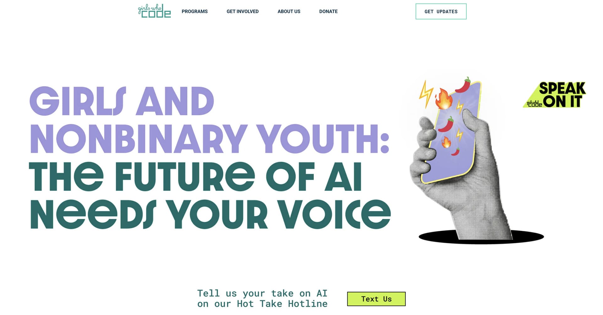
Organization Overview: Girls Who Code is an international nonprofit organization working to close the gender gap in technology by providing young women with access to computing education and mentorship. Since 2012, the organization has reached over 300,000 girls globally through summer programs, after-school clubs and campus initiatives.
Why Their Website Design is Top Tier:
- Bold, tech-forward visual identity – The website uses striking typography, vibrant colour schemes and modern geometric patterns that reflect the innovative spirit of the tech industry while creating an energetic, youth-focused aesthetic that appeals to both students and supporters.
- Persona-driven navigation – The site brilliantly segments content for distinct audiences (girls looking for programs, educators seeking resources, donors wanting to contribute and companies interested in partnerships), making it easy for each visitor type to find relevant information quickly.
- Program showcase excellence – Interactive elements highlight the breadth of Girls Who Code’s offerings, from free summer immersion programs to after-school clubs, with clear calls-to-action and application pathways that reduce barriers to participation for interested students.
- Impact storytelling through data – The website effectively communicates scale and success through compelling statistics (300,000+ girls reached, presence in all 50 US states) while featuring authentic student testimonials and success stories that bring the mission to life emotionally.
5. The Ocean Cleanup
Website: https://theoceancleanup.com/
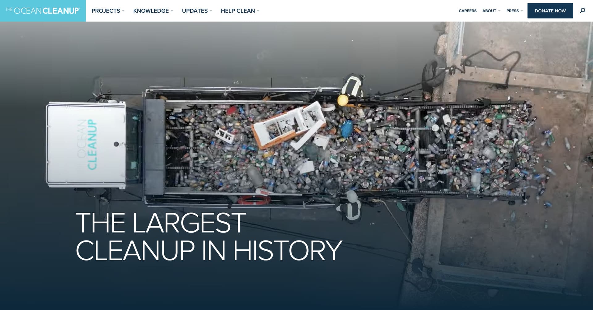
Organization Overview: The Ocean Cleanup is a nonprofit organization developing advanced technologies to remove plastic debris from the world’s oceans. The organization has successfully deployed cleanup systems in the Great Pacific Garbage Patch, collecting tons of plastic waste and inspiring global awareness about ocean pollution.
Why Their Website Design is Top Tier:
- Interactive technology showcase – The website uses stunning 3D visualizations, animated graphics and interactive elements to help visitors understand the scale of ocean pollution and the innovative engineering solutions being deployed to address this global crisis.
- Real-time impact dashboard – The site features live data feeds showing plastic collected, cleanup operations in progress and environmental impact metrics that create urgency and demonstrate tangible progress toward their ambitious ocean restoration goals.
- Scientific credibility presentation – The design balances emotional appeal with technical depth, featuring research publications, engineering specifications and partnership announcements that build trust with both general supporters and scientific community stakeholders.
- Visual environmental storytelling – Powerful underwater photography and aerial footage of plastic accumulation zones communicate the severity of the problem while highlighting the organization’s innovative approach to solving one of the planet’s most pressing environmental challenges.
6. Malala Fund
Website: https://malala.org/
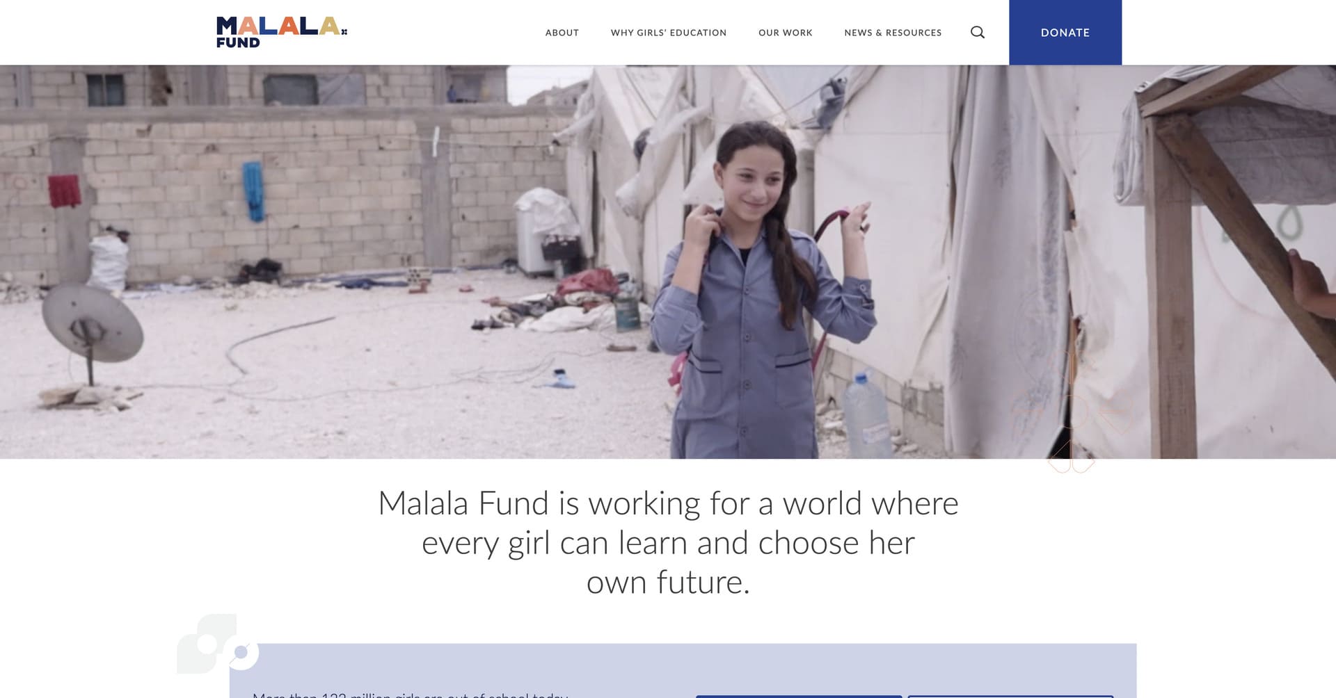
Organization Overview: Malala Fund is a nonprofit organization working to break down the barriers keeping 130 million girls out of school worldwide. Founded by Nobel Peace Prize laureate Malala Yousafzai, the organization advocates for policy changes, invests in education activists across 8 countries and elevates the voices of young women fighting for educational equality.
Why Their Website Design is Top Tier:
- Emotionally impactful visual design – The website features real-life videos and photography that create immediate emotional connections, showcasing both the challenges girls face in accessing education and the transformative power of learning opportunities.
- Direct and well-crafted donation funnel – The site employs a straightforward giving experience with clear impact messaging that connects donations directly to measurable outcomes, making it easy for supporters to contribute and understand exactly how their gift creates change.
- Cohesive, focused design system – Every element of the website – from typography to colour palette to imagery – works together to reinforce Malala Fund’s mission, creating a unified brand experience that builds recognition and trust across all touchpoints.
- Country-specific program visualization – The website uses custom icons and patterns to help users navigate between different countries where Malala Fund operates, giving each region its own distinct visual identity while maintaining overall brand consistency.
7. 826 National
Website: https://826national.org/
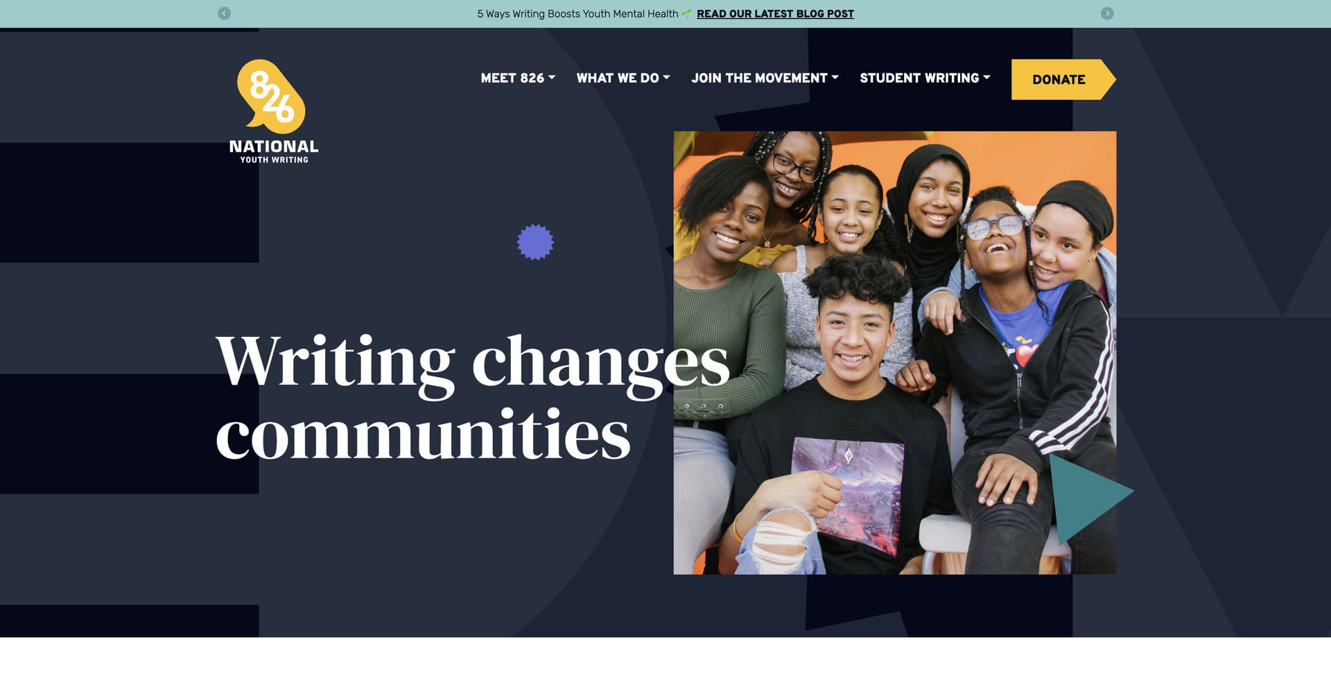
Organization Overview: 826 National leads the largest youth writing network in the United States, supporting local programs that provide under-resourced students with high-quality writing instruction and publishing opportunities. The organization operates 9 chapters across the country, each featuring uniquely themed retail stores alongside their writing centres.
Why Their Website Design is Top Tier:
- Playful, literacy-focused branding – The website employs whimsical design elements, creative typography and colourful illustrations that reflect the joy and creativity of writing, creating an approachable atmosphere that appeals to students, educators and supporters alike.
- Multi-stakeholder content architecture – The site expertly serves diverse audiences including students seeking programs, teachers looking for resources, volunteers wanting to get involved and donors interested in supporting youth literacy, with clear navigation pathways for each group.
- Student work showcase – The website prominently features actual writing samples and published work from students, demonstrating the tangible outcomes of their programs while celebrating young authors and giving them an authentic audience for their creative expression.
- Unique chapter identity integration – The design balances national brand consistency with local chapter personality, highlighting each location’s distinctively themed separate website, making the organization memorable and community-rooted.
8. Kiva
Website: https://www.kiva.org/
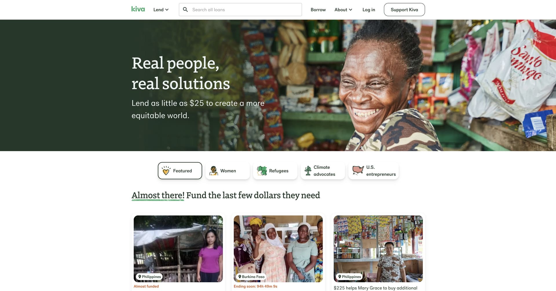
Organization Overview: Kiva is a nonprofit organization that expands financial access to help underserved communities thrive through microfinance lending. The platform connects individual lenders with borrowers around the world, enabling people to lend as little as $25 to create opportunity and has facilitated over $1.3 billion in loans to 3.3 million entrepreneurs and families.
Why Their Website Design is Top Tier:
- Illustration-driven visual identity – Kiva uses a distinctive illustration style featuring bold colours, celebratory graphics and emotionally evocative portraits that set them apart from typical nonprofit photography and create a memorable, optimistic brand presence.
- Personalized lending experience – The website makes microfinance tangible and personal by showcasing individual borrower profiles with photos, stories and specific funding goals, allowing lenders to directly connect with entrepreneurs they’re supporting around the globe.
- Gamified engagement – The platform incorporates progress tracking, lending badges and community features that transform philanthropy into an interactive experience, encouraging repeat engagement and building a committed community of lenders.
- Multi-layered transparency – Kiva provides detailed information about field partners, loan repayment rates (96.6% success rate), borrower updates and impact metrics that build trust and demonstrate the effectiveness of their peer-to-peer microfinance model.
9. Echoing Green
Website: https://echoinggreen.org/
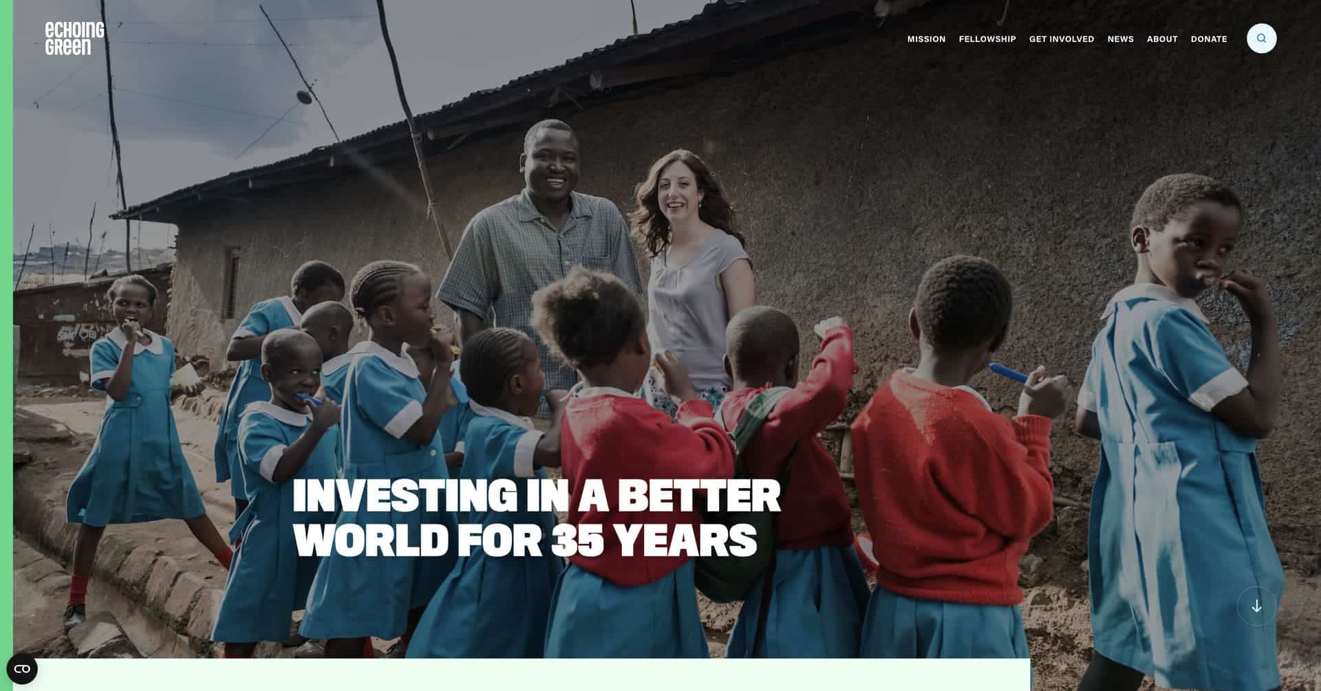
Organization Overview: Echoing Green identifies and invests in the world’s most promising social entrepreneurs, providing seed funding and customized support to help them launch innovative solutions to society’s biggest problems. For nearly 40 years, the organization has supported over 800 social entrepreneurs who have gone on to become transformative leaders in their fields.
Why Their Website Design is Top Tier:
- Dynamic, entrepreneur-focused narrative – The website spotlights social entrepreneurs through compelling storytelling and vibrant visuals, positioning them as visionary leaders driving social change rather than traditional charity recipients.
- Sophisticated professional aesthetic – The site employs a modern, corporate-inspired design that appeals to both individual donors and foundation partners, reflecting Echoing Green’s position as a strategic investor in high-potential social ventures.
- Fellowship program clarity – Complex application processes and program details are organized with exceptional clarity, making it easy for prospective social entrepreneurs to understand eligibility requirements, funding opportunities and support services available.
- Impact amplification showcase – The website features interactive elements highlighting the collective impact of their fellowship community, demonstrating how investing in individual leaders creates ripple effects that transform entire sectors and communities.
10. DonorsChoose
Website: https://www.donorschoose.org/
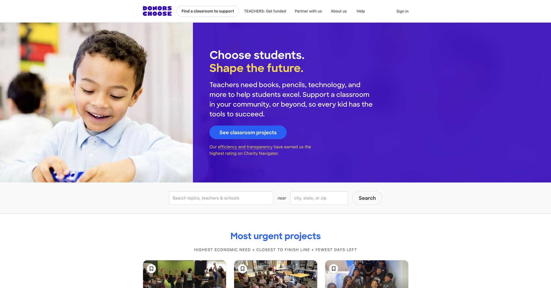
Organization Overview: DonorsChoose is a nonprofit organization that connects public school teachers with individual donors to fund classroom projects and educational resources. The platform has facilitated over $1 billion in donations, supporting more than 2 million projects in under-resourced schools across the United States.
Why Their Website Design is Top Tier:
- Playful, education-inspired branding – The website features a distinctive illustration style using bright colours, geometric shapes and diverse human figures in action that creates an energetic, optimistic atmosphere perfectly suited to supporting public education.
- Transparent project marketplace – DonorsChoose makes giving tangible by showcasing specific classroom projects with teacher-written descriptions, student demographics, funding progress bars and required materials, allowing donors to see exactly what their contribution will provide.
- Design playground feature – The organization created an interactive tool where teachers and donors can customize graphics and social media assets using DonorsChoose’s design elements, fostering community engagement and making it easy to spread awareness.
- Results-oriented user experience – The site excels at converting browsers into donors through strategic placement of compelling teacher stories, urgent funding needs and impact statistics that create emotional connections and motivate immediate action.
Key Takeaways for Your Nonprofit Website Design
The best nonprofit websites of 2026 demonstrate that exceptional design goes far beyond aesthetics – it’s about creating strategic digital experiences that inspire action and drive measurable impact. These organisations understand that every design decision, from colour choices to navigation structure, either facilitates or hinders their mission.
Several patterns emerge from these outstanding nonprofit website examples. First, emotional storytelling remains paramount. The most effective sites use powerful visuals and authentic narratives to create genuine connections with visitors. Second, transparency builds trust. Organizations that openly share their impact metrics, financial information and success stories inspire confidence and encourage giving. Third, frictionless donation experiences convert supporters. The best sites make giving effortless with clear calls-to-action, streamlined forms and mobile-optimized processes.
These nonprofit web design examples also highlight the importance of serving diverse audiences simultaneously. Whether distinguishing between donors and beneficiaries, volunteers and corporate partners, or individual supporters and institutional funders, exceptional nonprofit websites create clear pathways for each audience without overwhelming visitors.
To Sum Up
Your nonprofit’s website is working for you 24 hours a day, 7 days a week. It’s raising funds while you sleep, recruiting volunteers while you’re in meetings and telling your story to potential supporters across the globe. That’s why investing in exceptional nonprofit website design isn’t a luxury – it’s a strategic imperative that directly impacts your organization’s ability to fulfill its mission.
The nonprofit websites featured here set a high bar, but they also provide a clear roadmap for what’s possible. They prove that compelling design combined with strategic thinking can transform a website from a static brochure into a dynamic fundraising and engagement engine that drives real-world impact.
In 2026 and beyond, the nonprofits that will thrive are those that recognize their website as mission-critical asset deserving of the same attention and investment as their programs. Your online presence isn’t separate from your impact – it’s the primary vehicle through which most supporters will discover, connect with and contribute to your cause.
Looking for more nonprofit web design strategies? Check out our top 10 web design tips for nonprofits in 2026.
Thinking about outsourcing your nonprofit web design project? Get in touch with our team!


